Our Web Design & Development services focus on creating visually engaging, user-friendly websites that make a lasting impact. We combine cutting-edge design with seamless functionality to ensure your site not only looks great but also performs efficiently across devices. From crafting responsive layouts to optimizing user experiences, our team tailors each project to meet your unique brand needs and goals. With a strategic approach to design and development, we help your business establish a strong digital presence that attracts visitors and drives results.
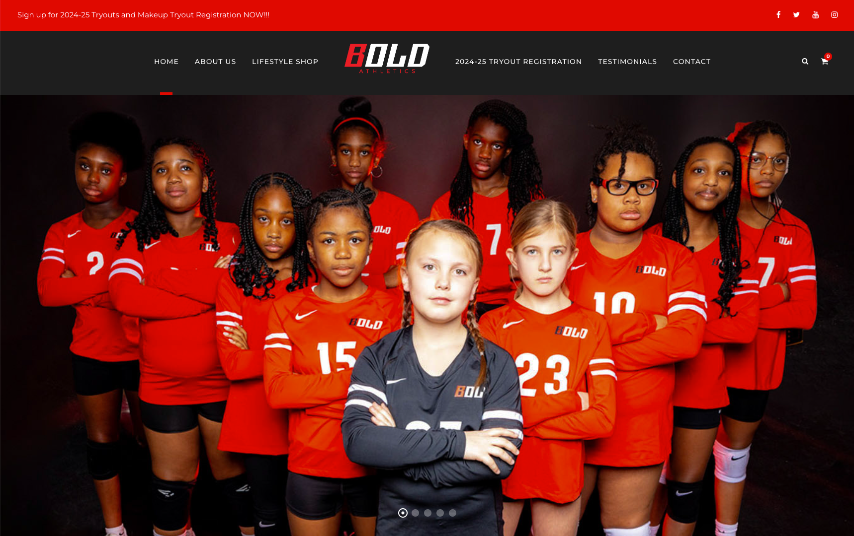
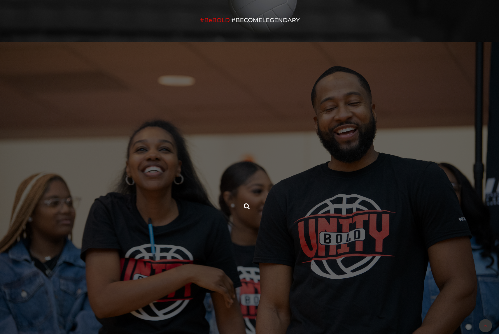
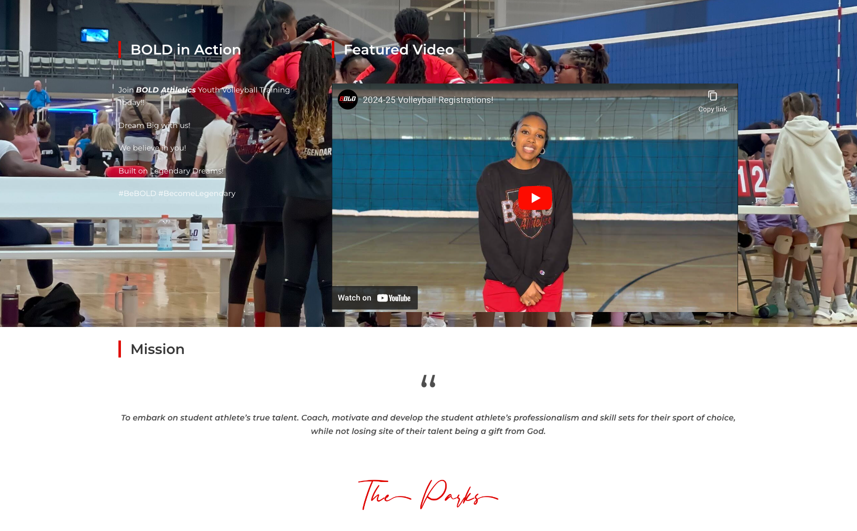
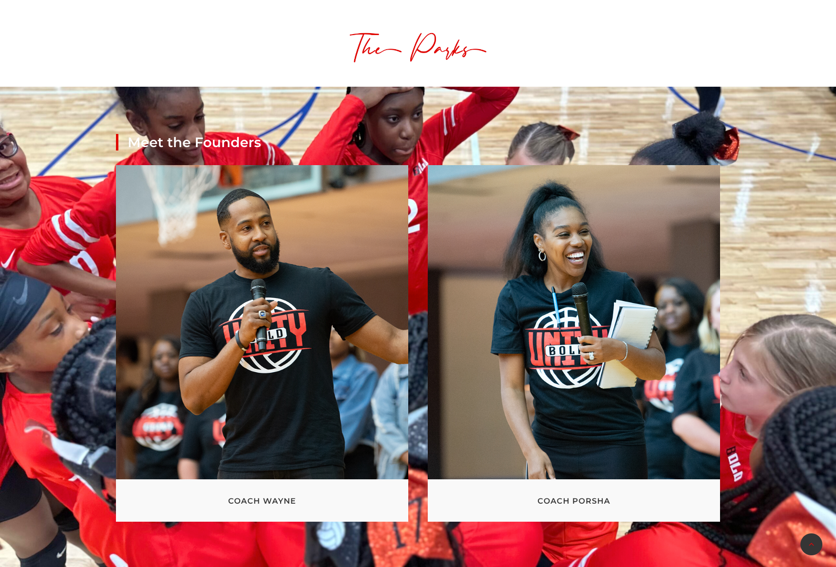
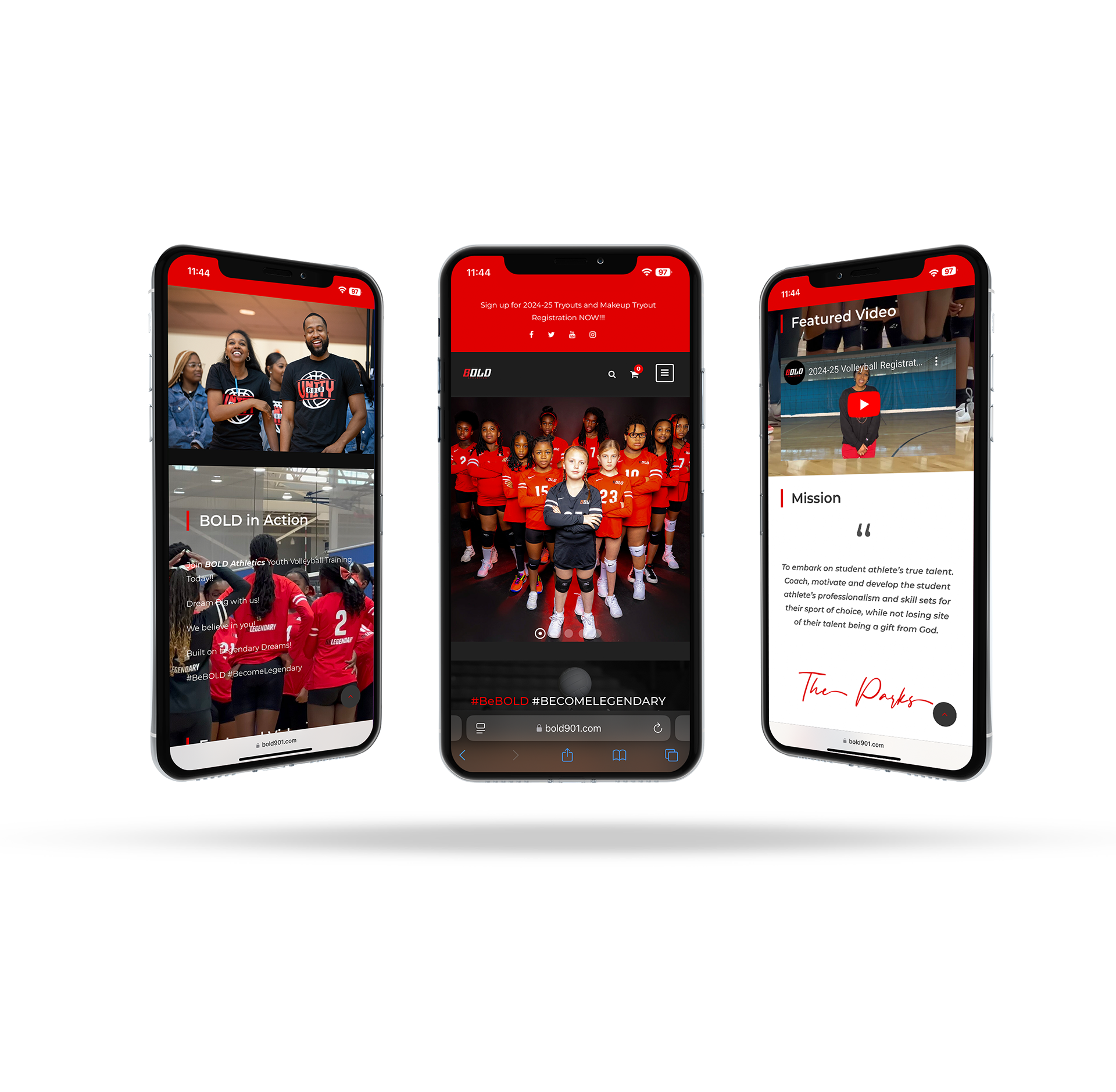
Case Study: Bold Athletics
Industry: Sports
Services Provided: Website Development
Services Provided: Website Development
Client Overview
BOLD Athletics is a youth volleyball and athletic training company focused on developing the talents and professionalism of student-athletes. Their mission is to coach, motivate, and inspire young athletes by nurturing their skills and character, while also providing essential support through the recruiting process to college athletics.
Project Objective
BOLD Athletics needed a website that could act as an informative and engaging platform for both student-athletes and their parents. The site needed to communicate the brand’s mission, highlight their unique training programs, and support families with the resources required for the NCAA recruitment journey, including insights on documentation, testing, and NIL rules.
Design & Development Approach
Mission-Focused Layout: Designed the website to prominently feature BOLD Athletics’ mission, values, and philosophy on youth athletic development. This layout reinforces the organization’s commitment to personal growth and athletic excellence.
Comprehensive Service Sections: Developed clear sections dedicated to each aspect of BOLD’s services, including skill assessment, individualized training, and character development, alongside resources for parents on NCAA regulations and college prep requirements.
User-Centric Navigation: Built intuitive navigation that allows users to easily locate training schedules, recruiting guidance, and other essential information. This design approach supports parents and athletes in accessing resources quickly.
Visual Storytelling & Branding: Incorporated vibrant, athletic-inspired visuals that capture the energy and determination associated with youth sports, creating a visually compelling experience that resonates with athletes and their families.
Responsive Design: Ensured the site is fully responsive, providing accessibility on all devices to accommodate the active lifestyles of student-athletes and their parents.
Outcome
The BOLD Athletics website now serves as a vital resource for student-athletes and their families, effectively communicating the company’s mission while offering practical tools and information on the recruitment process. The site’s design and structure have received positive feedback for their clarity, professionalism, and user-friendly layout.
Key Results
Enhanced Engagement: Increased interest from both athletes and parents in training programs and recruitment services.
Improved Brand Recognition: Strengthened BOLD Athletics’ visibility as a trusted resource in youth volleyball and athletic development.
Resource Accessibility: Provided a centralized, accessible hub for vital recruitment resources, leading to higher parent and athlete preparedness for NCAA compliance and opportunities.
This project effectively translated BOLD Athletics’ commitment to youth development into a digital space, equipping athletes and their families with the guidance and resources needed to succeed in collegiate athletics.
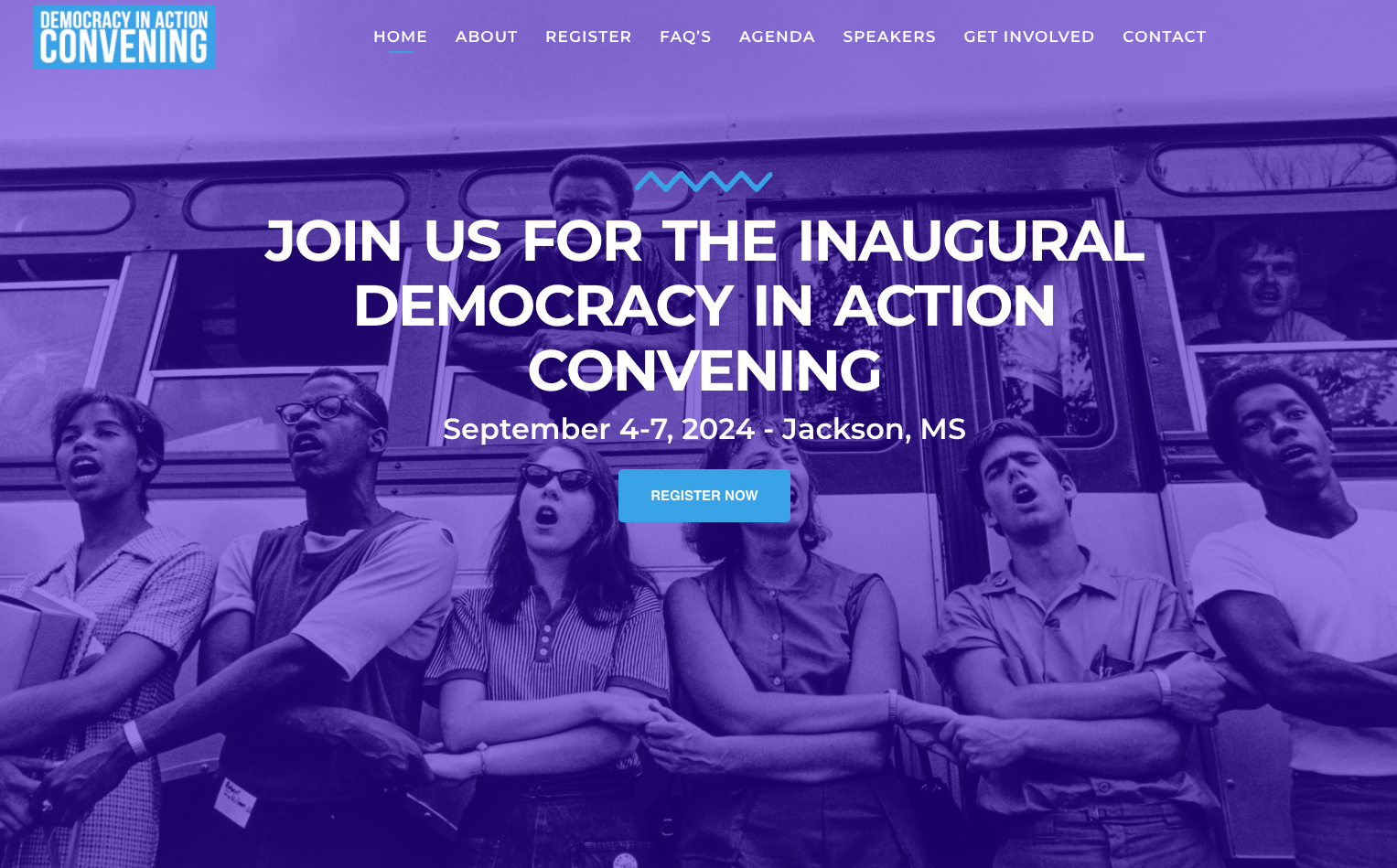
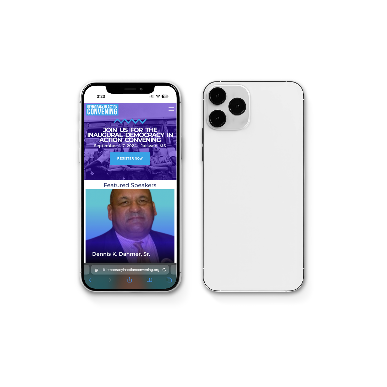
Case Study: Democracy in Action Convening
Industry: Civic & Social Organization
Services Provided: Website Development
Services Provided: Website Development
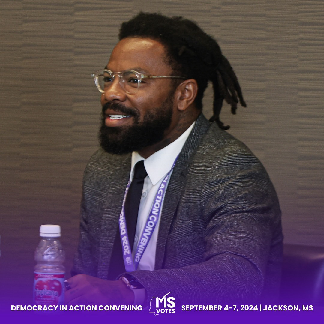
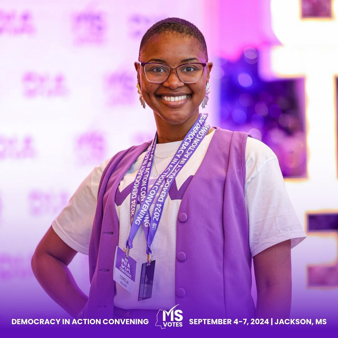
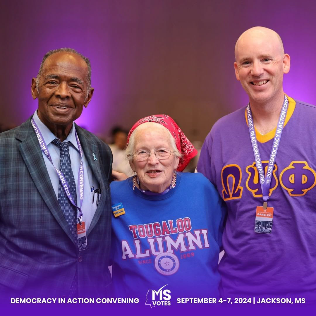
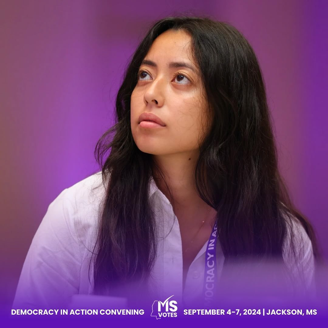
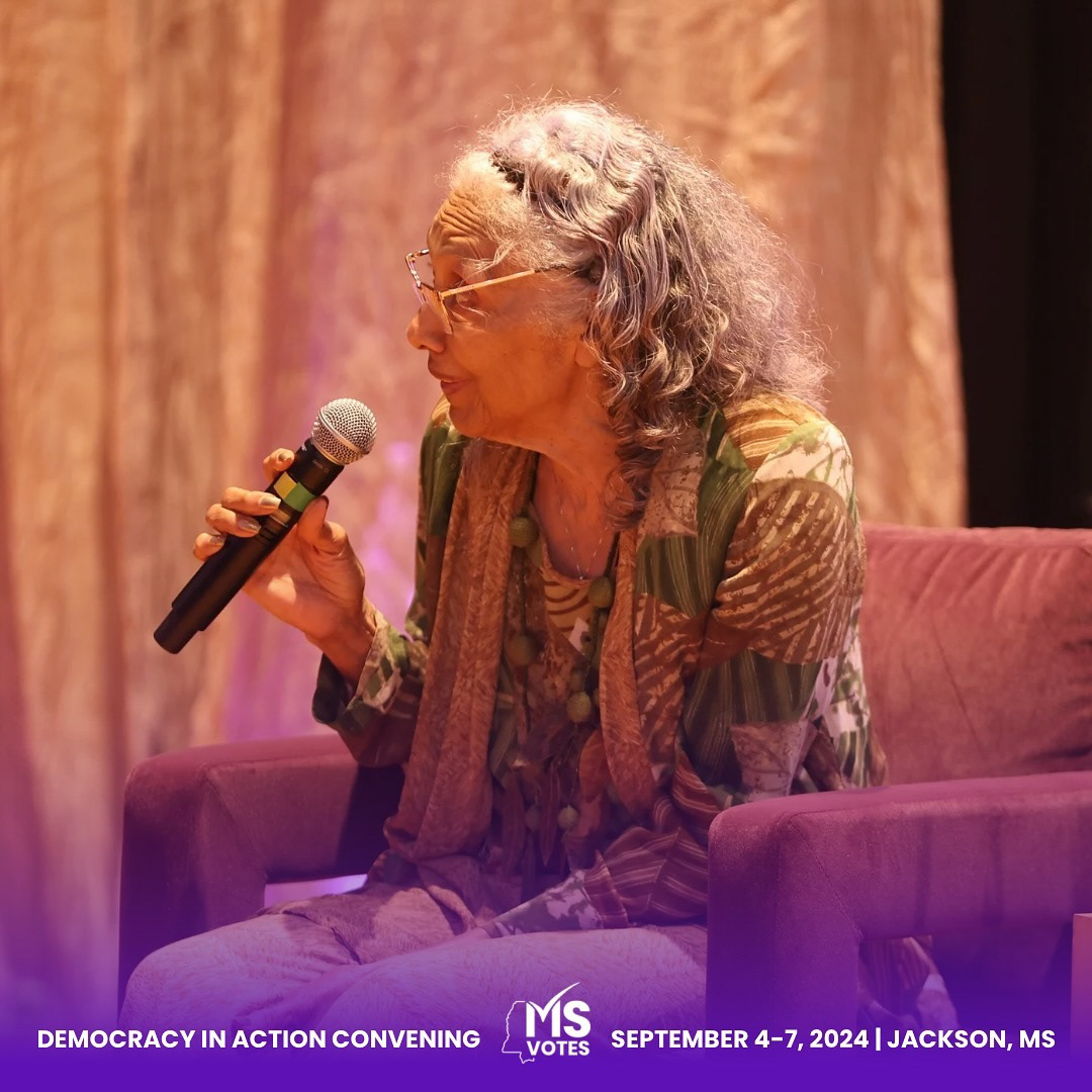
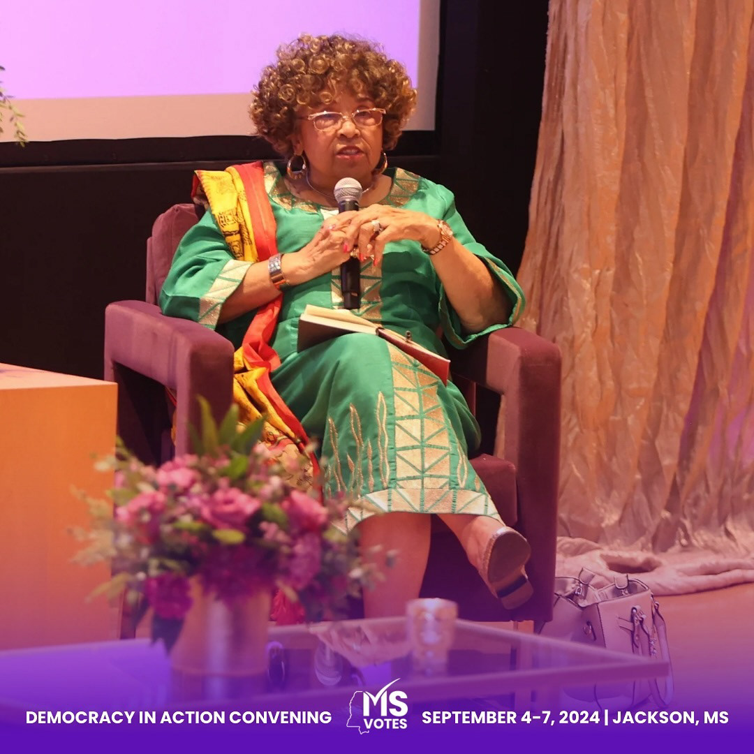
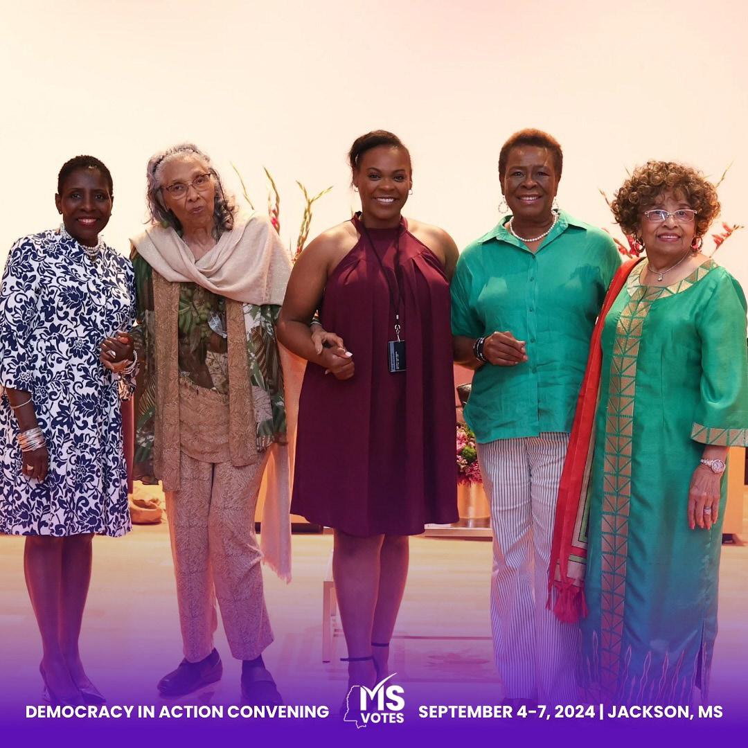
Client Overview
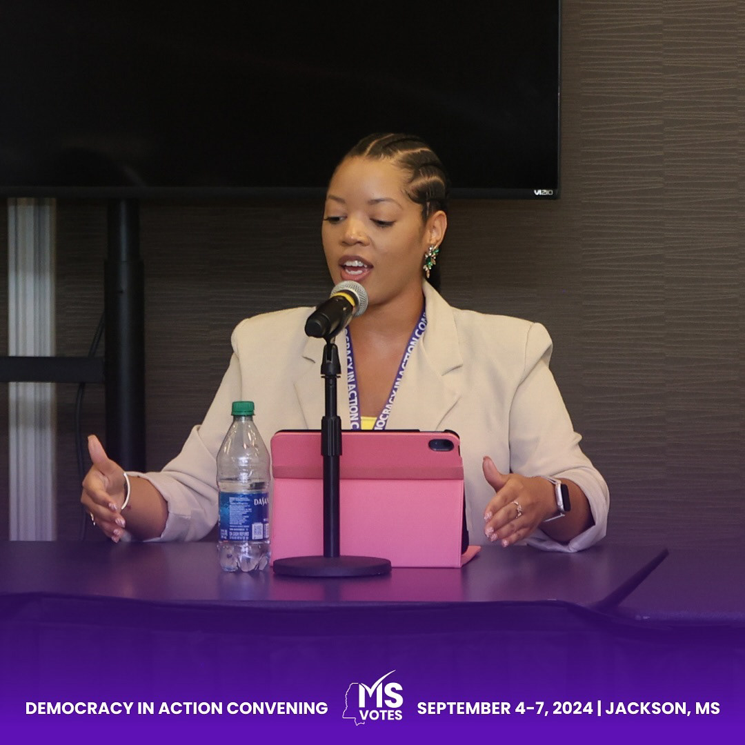
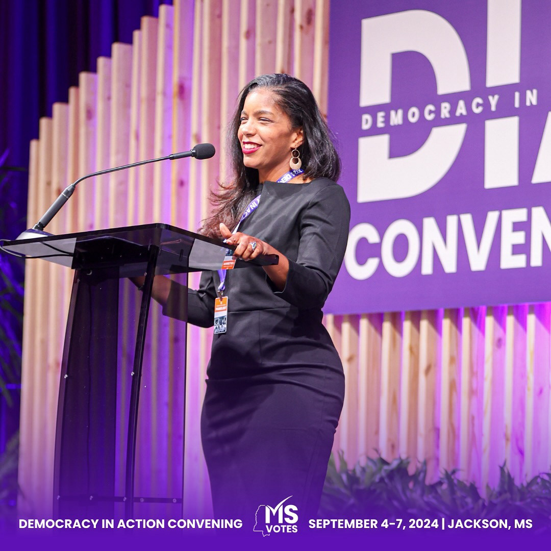
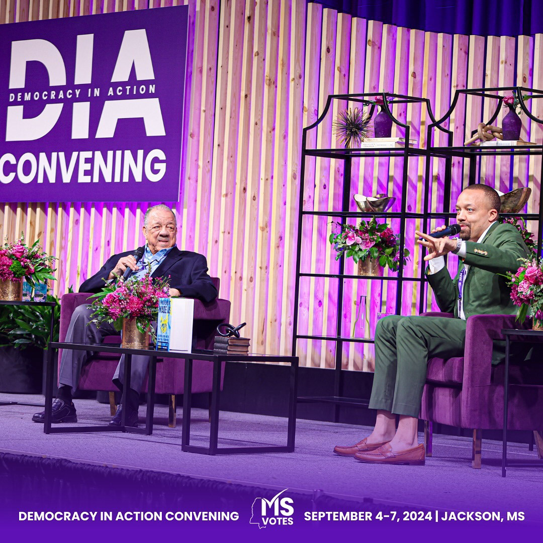
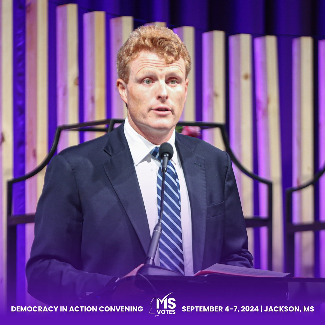
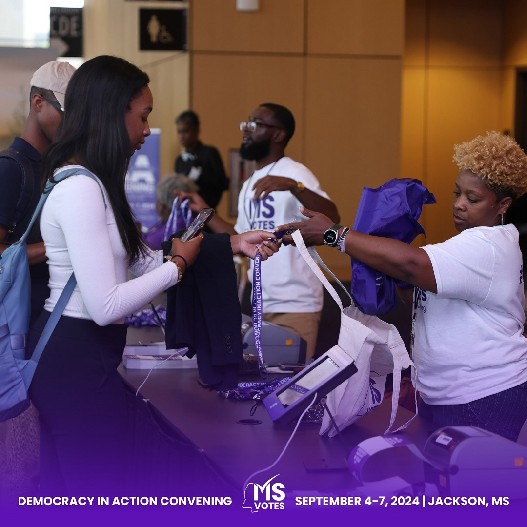
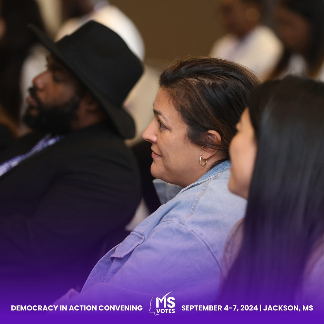
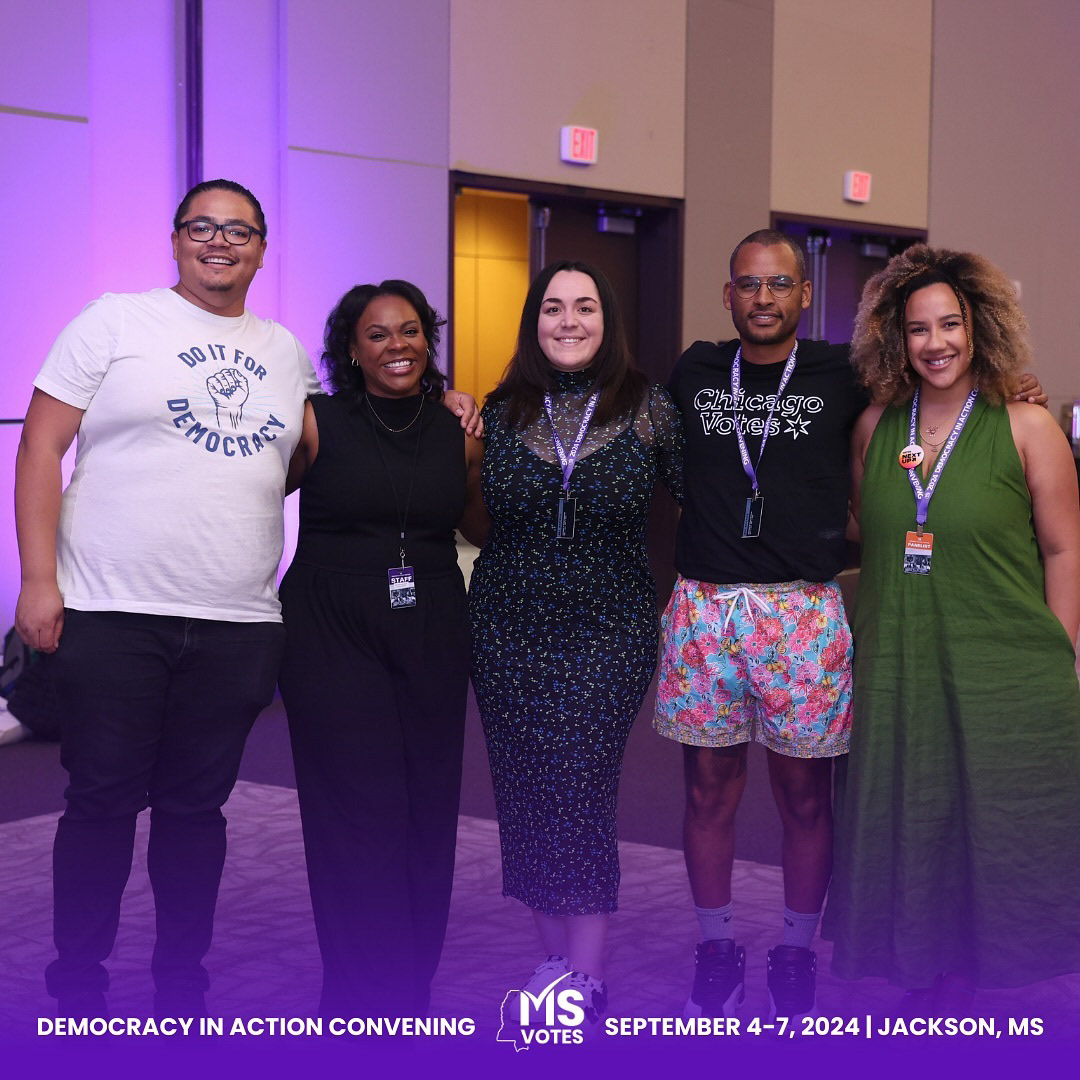
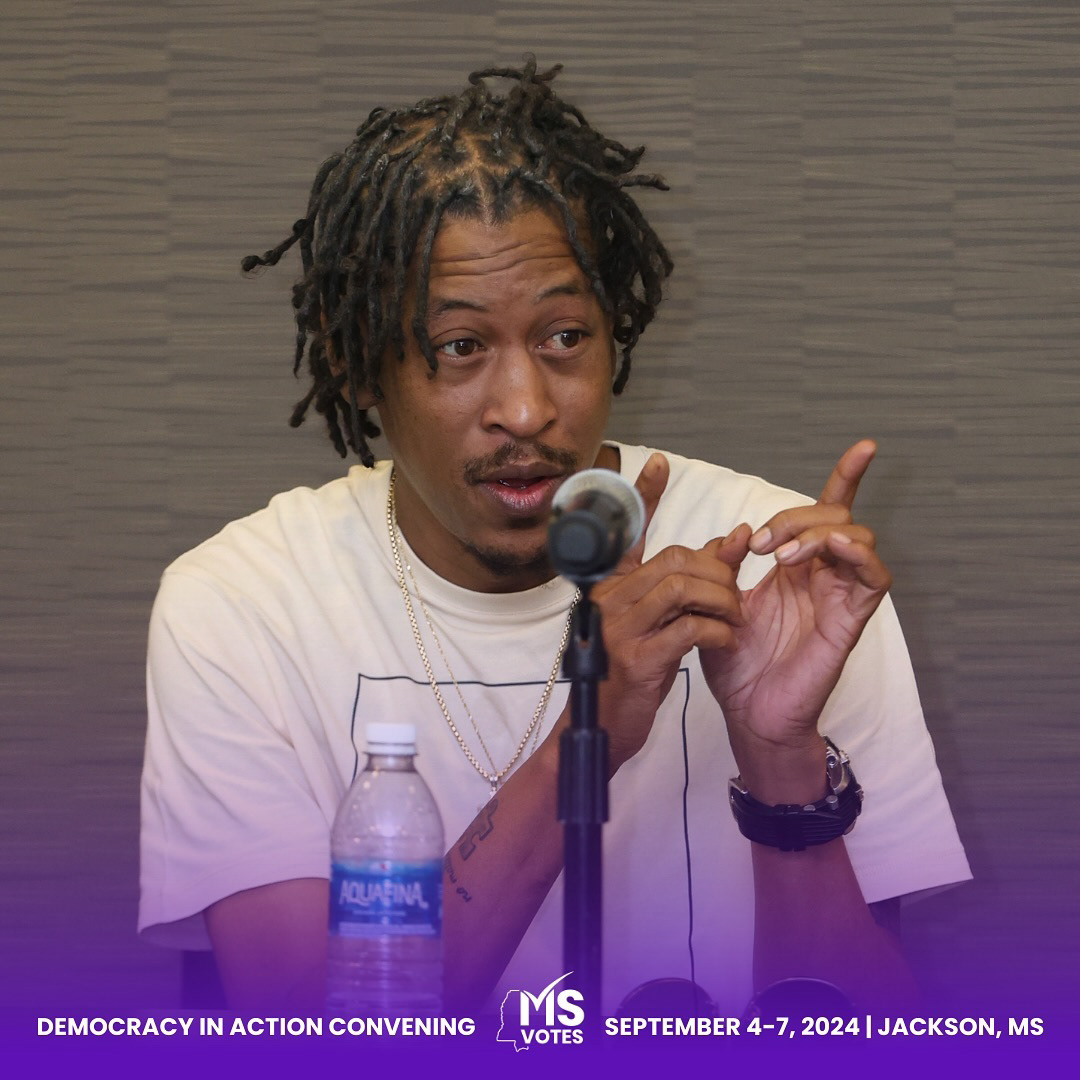
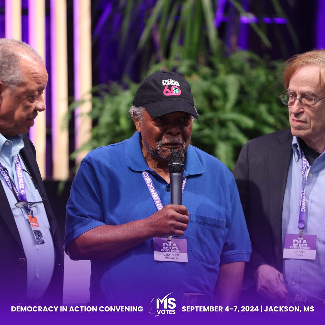
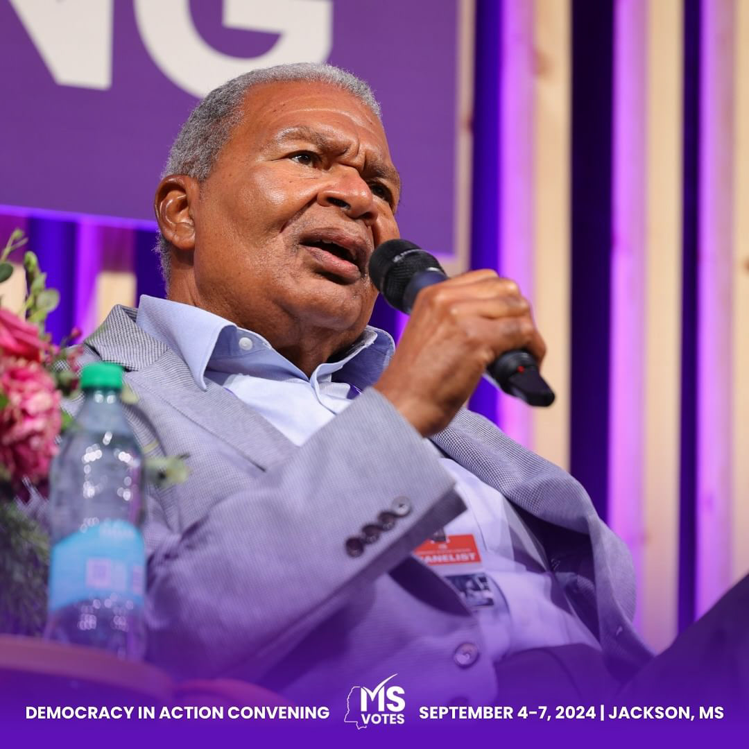
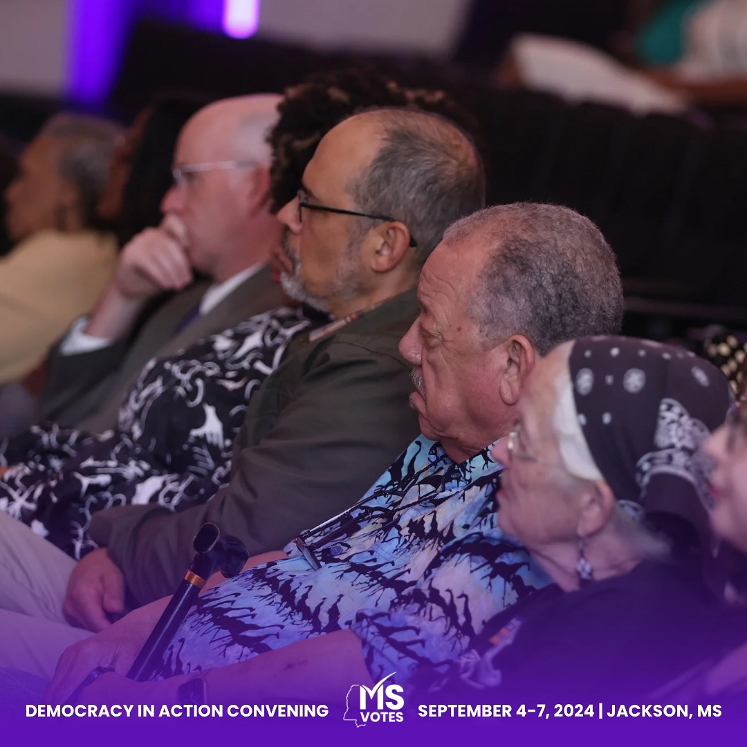
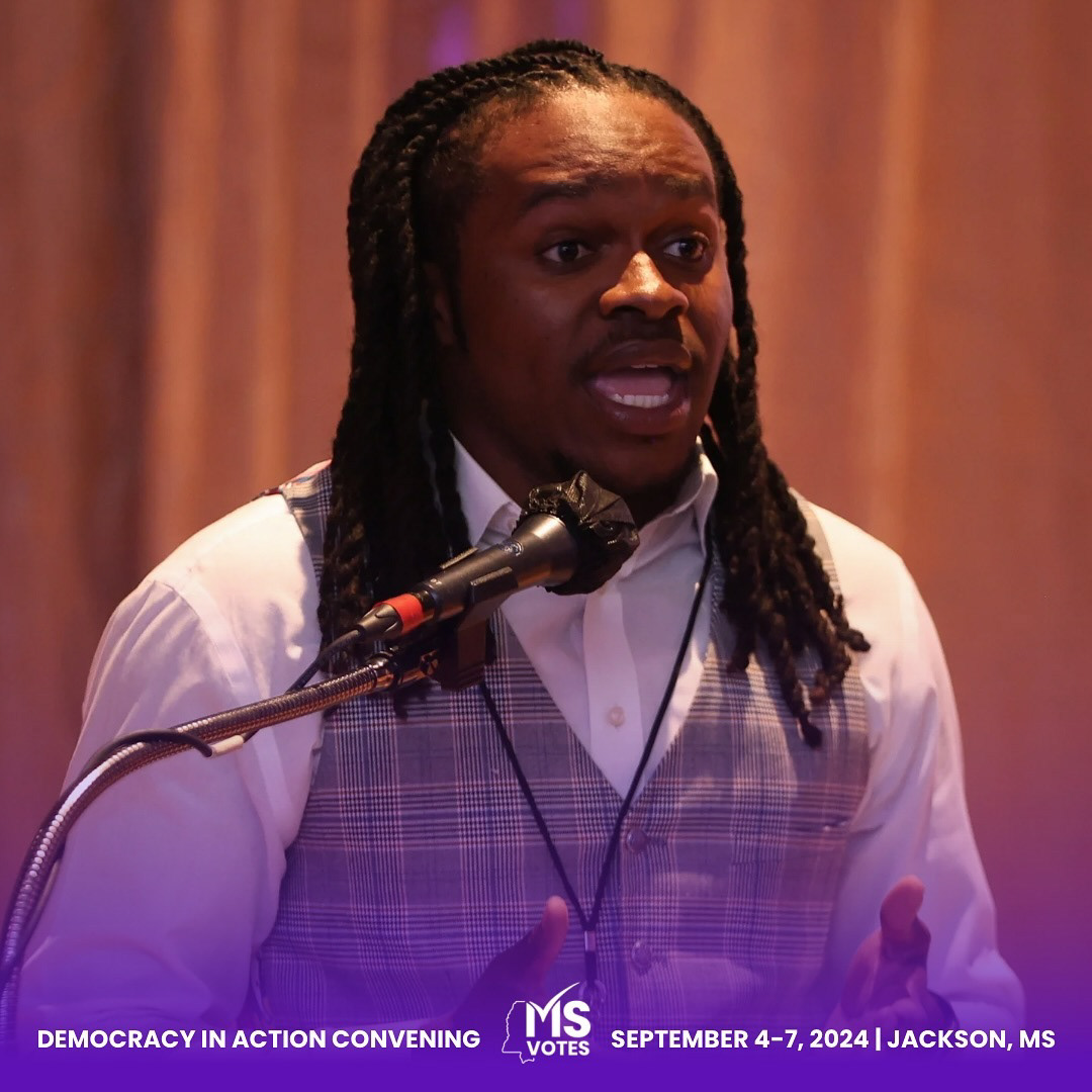
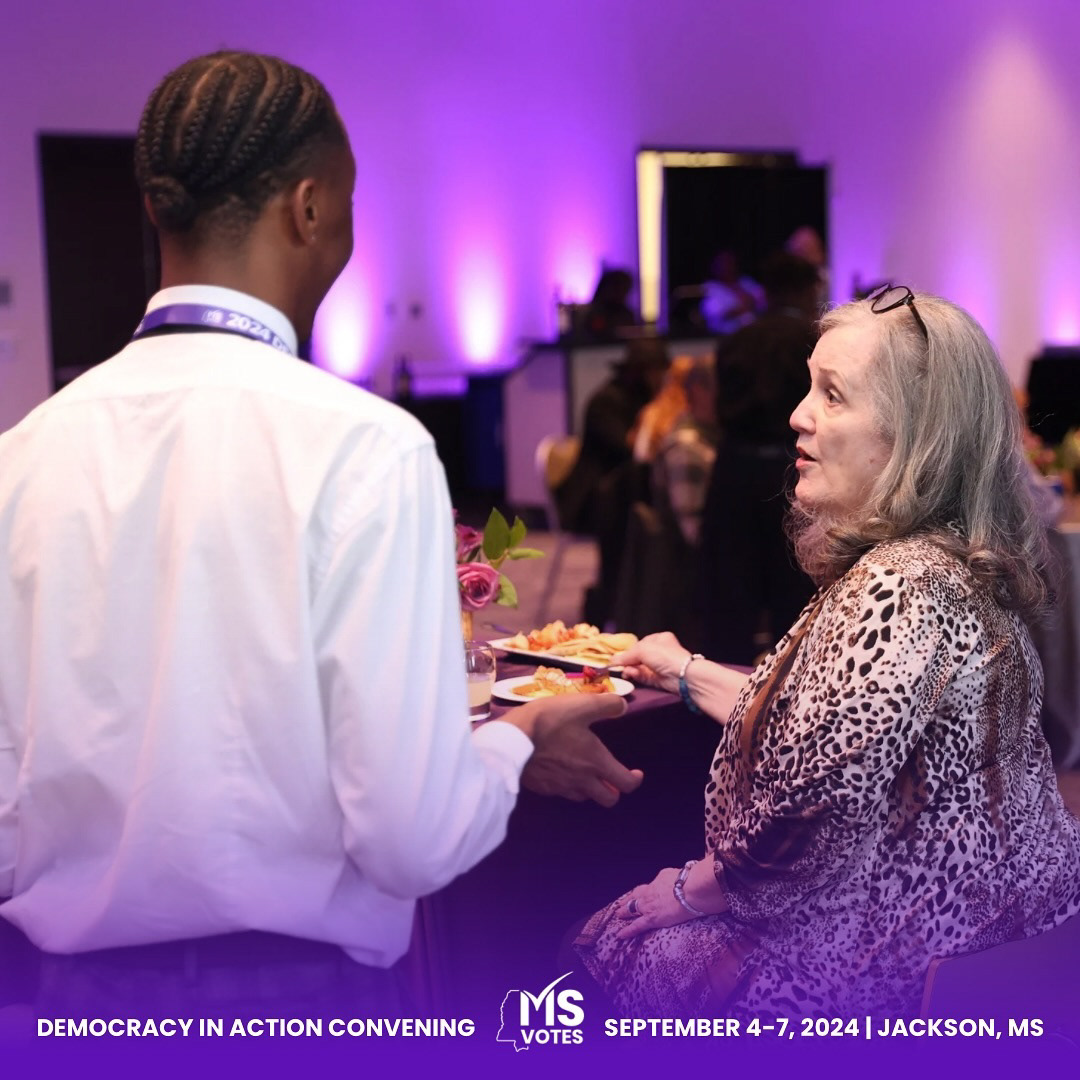
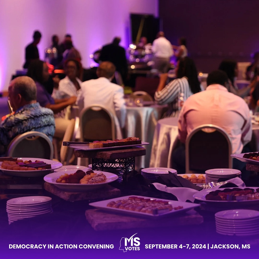
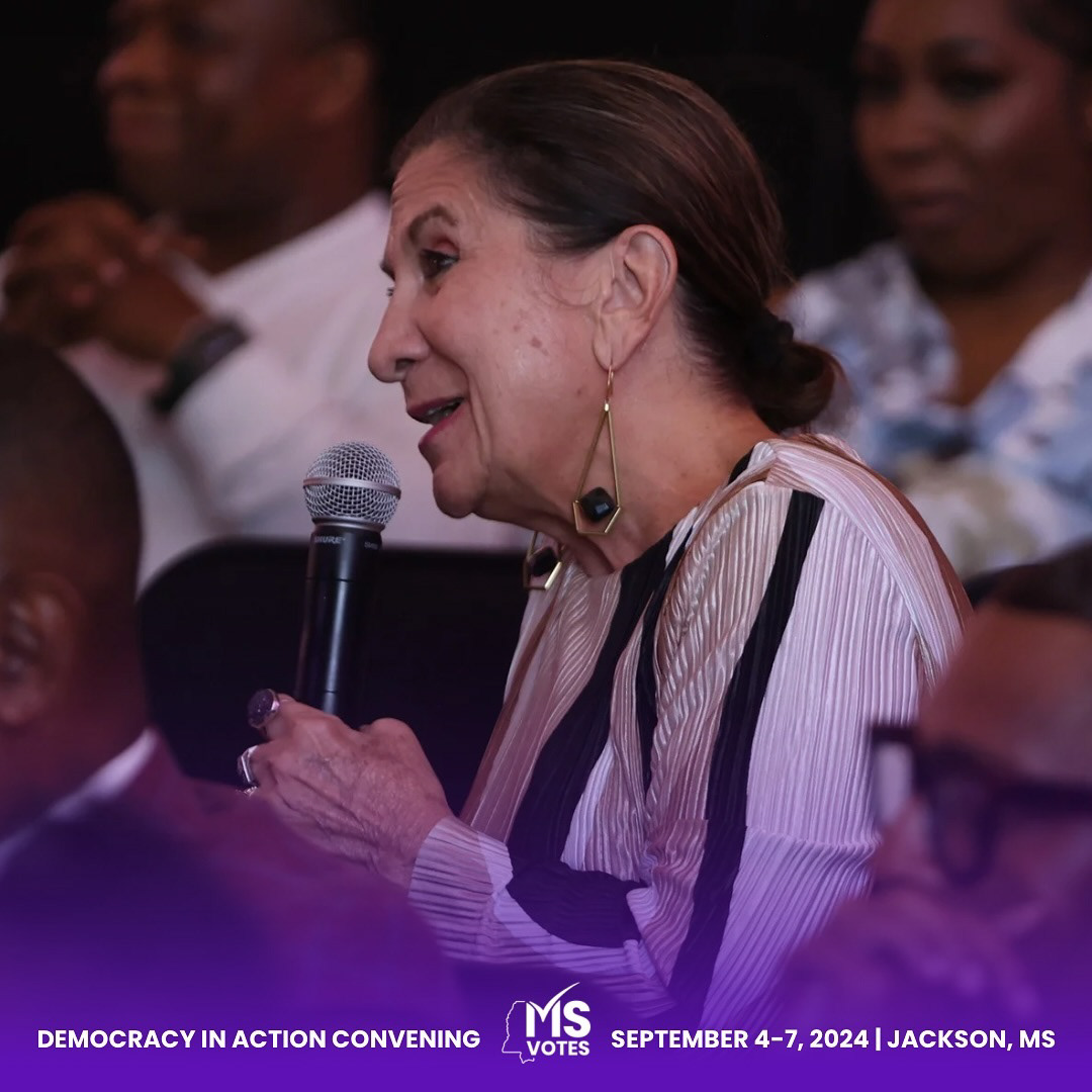
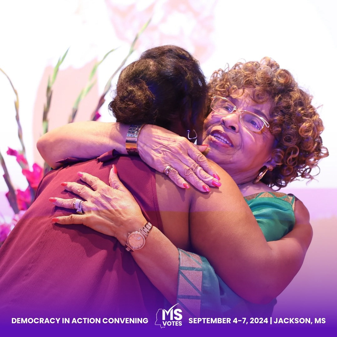
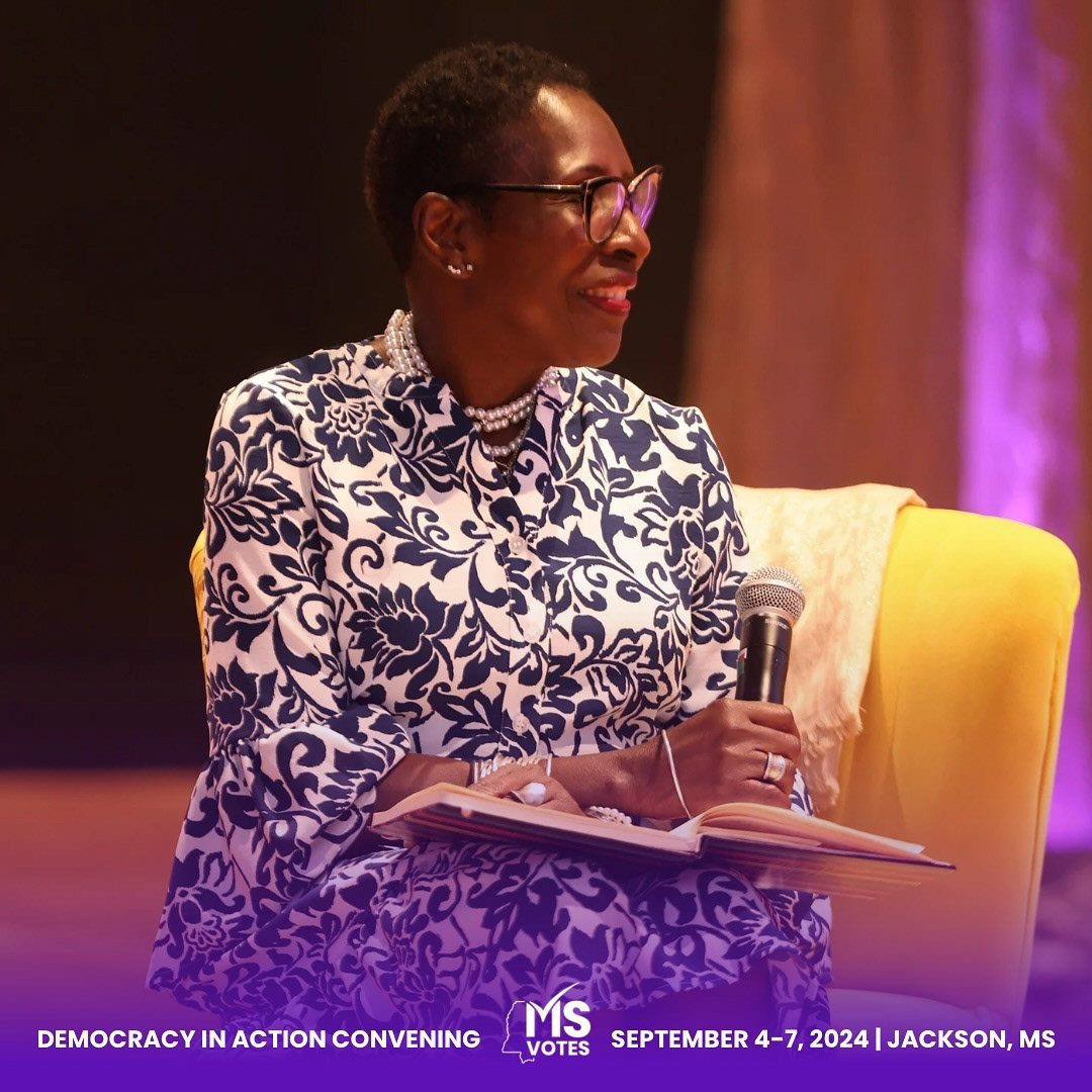
Democracy in Action Convening is an initiative aimed at bringing together advocates, leaders, and organizations to strengthen democracy through collective action and shared strategies. The organization needed a website that would serve as a hub for event information, registration, and resources for attendees, while also promoting the convening’s goals of civic engagement and collaboration.
Project Scope
The primary goal was to develop an informative and easy-to-navigate website that highlights the organization’s mission, outlines the details of the event, and provides a seamless registration process for attendees. The site also needed to house a variety of resources for those interested in democracy-building initiatives.
Challenges
Information Architecture: The site needed to present detailed event information in a clear and engaging manner without overwhelming users.
Registration Process: Creating a user-friendly and secure registration system for event participants.
Engagement: Encouraging active participation and resource sharing through an accessible and visually appealing platform.
Solution
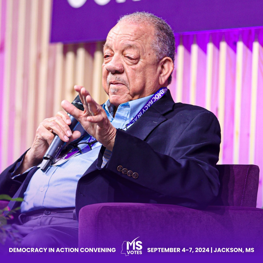
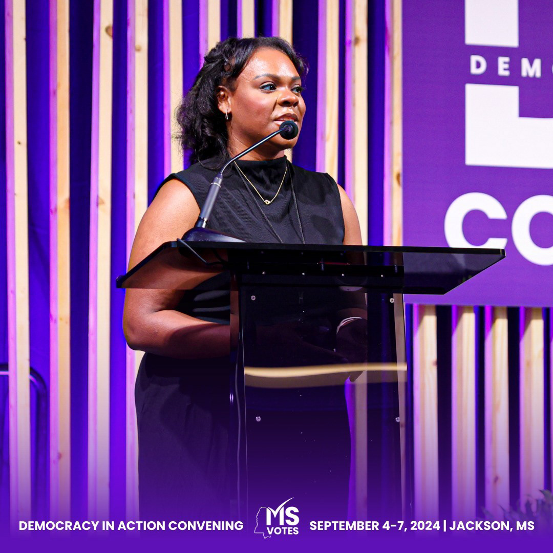
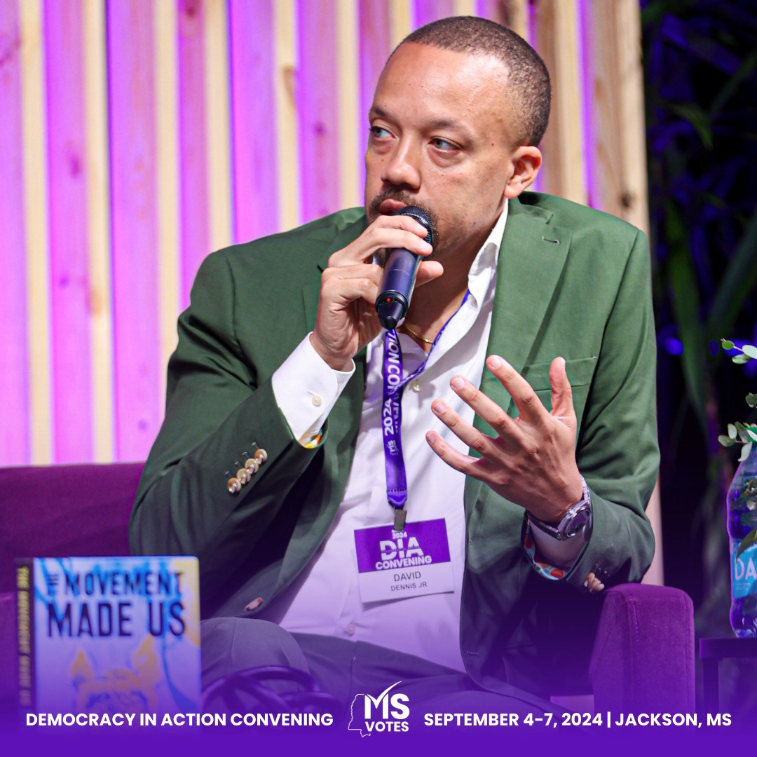
Visual Design: Developed a professional and engaging design using a clean layout and an appropriate color palette that conveys the importance and seriousness of the convening’s goals. The use of impactful imagery related to civic engagement complemented the messaging.
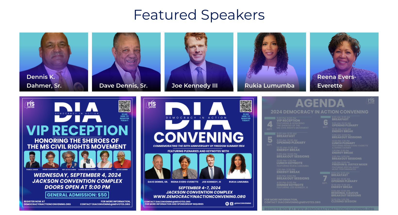
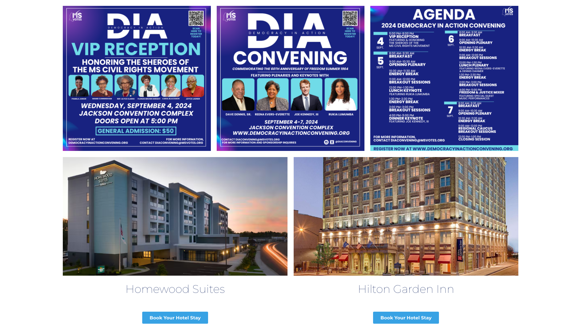
Clear Information Layout: Structured the website to ensure that all key event details—including dates, speakers, sessions, and resources—were easily accessible. A dedicated section for event updates was also included to keep attendees informed.
Registration System: Implemented a secure and streamlined registration system that allowed attendees to register, view the agenda, and receive updates. The registration form was designed to be intuitive, minimizing barriers to signing up.
Resource Section: Created a dedicated area for resources such as reports, videos, and downloadable materials related to democracy and civic engagement. This served as a useful hub for attendees to access important information before and after the event.
Mobile Responsiveness: Ensured the website was fully optimized for mobile, allowing users to easily access information and register from any device.
Results
Increased Registrations: The straightforward registration process contributed to an increase in sign-ups for the event, making it easier for a wider audience to engage with the convening.
Positive User Experience: The clear layout and easy navigation made it simple for attendees to find event details and access resources, enhancing overall engagement with the platform.
Amplified Mission Awareness: The website effectively communicated the convening’s mission, helping to spread awareness about the importance of civic engagement and democracy-building efforts.
Conclusion
The Democracy in Action Convening website successfully provided a platform that not only informed and engaged users but also supported the organization’s broader mission of strengthening democracy. Through a user-centered design and an intuitive interface, the site facilitated increased participation and enhanced the event’s impact.
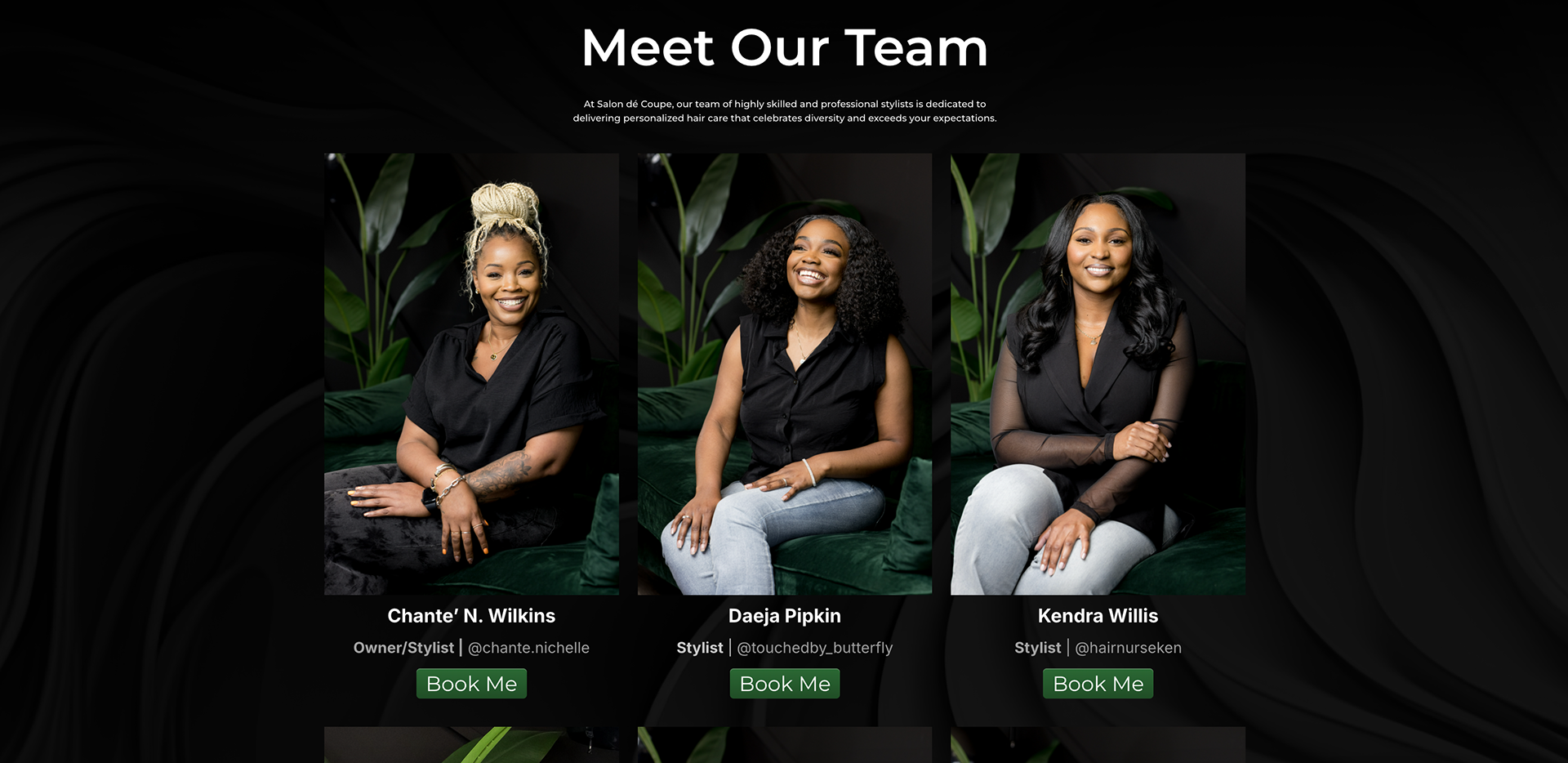
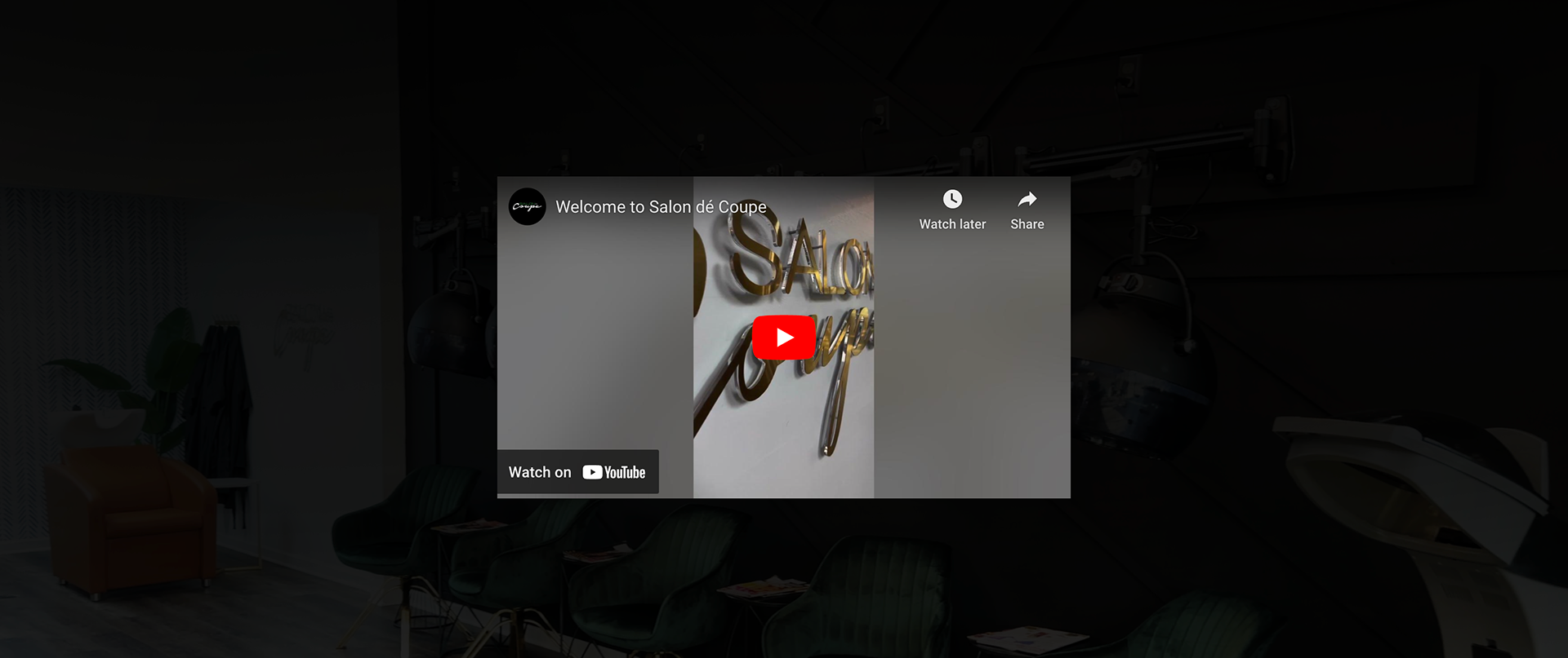
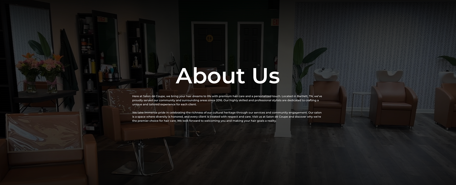
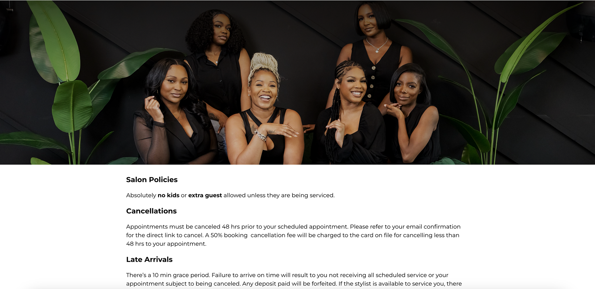
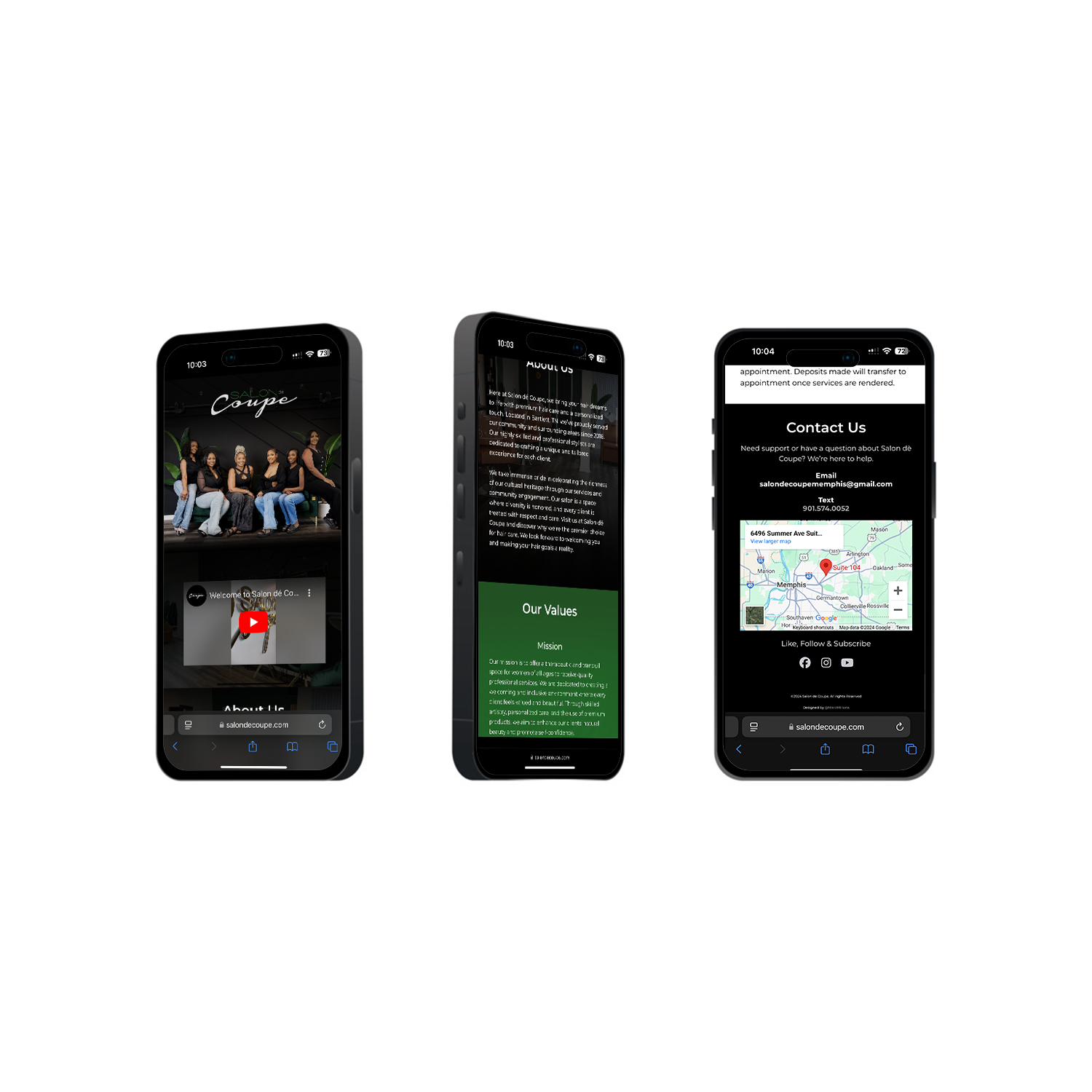
Case Study: Salon De Coupe
Industry: Beauty
Services Provided: Logo Design, Signage & Website Development
Services Provided: Logo Design, Signage & Website Development
Client Overview:
Salon de Coupe, a premier hair salon, needed a website that would reflect their dedication to style, elegance, and exceptional customer service. They sought a digital presence that would capture the essence of their salon, showcase their services and team, and streamline appointment booking for clients. The goal was to create an immersive experience that would highlight their brand and make it easy for customers to connect with their services.
Project Scope:
The project involved designing a visually appealing, user-friendly website that would serve as a comprehensive online hub for Salon de Coupe. The scope included:
The project involved designing a visually appealing, user-friendly website that would serve as a comprehensive online hub for Salon de Coupe. The scope included:
Creating an elegant, brand-aligned design that reflects Salon de Coupe’s upscale vibe.
Structuring the site to showcase key services, team expertise, and salon ambiance.
Integrating a seamless appointment booking system for client convenience.
Ensuring mobile responsiveness and easy navigation across devices.
Challenges:
Balancing a sophisticated design with usability, ensuring the site was both attractive and functional.
Highlighting various services and team members without overwhelming users with information.
Implementing an intuitive booking process that would be straightforward for clients to navigate.
Solutions:
Developed a clean, modern layout that emphasizes visual appeal while maintaining clarity and accessibility.
Created dedicated sections for services, team bios, and client testimonials, presenting information in a digestible format.
Integrated an appointment booking feature directly into the site, making it easy for users to schedule services.
Optimized the website for mobile devices to ensure a seamless experience for all users.
Results:
The new website has improved Salon de Coupe’s online presence, providing a professional platform that attracts and engages clients.
The sleek design, combined with detailed service descriptions, has enhanced brand perception and supported business growth.
The integrated booking system has simplified appointment scheduling, contributing to a more efficient customer experience.
Conclusion:
The Salon de Coupe website design successfully captures the brand’s luxurious essence and commitment to quality. With an elegant design and user-centric features, the website has become a valuable tool for driving engagement and appointments, reflecting the salon’s dedication to excellence.
The Salon de Coupe website design successfully captures the brand’s luxurious essence and commitment to quality. With an elegant design and user-centric features, the website has become a valuable tool for driving engagement and appointments, reflecting the salon’s dedication to excellence.
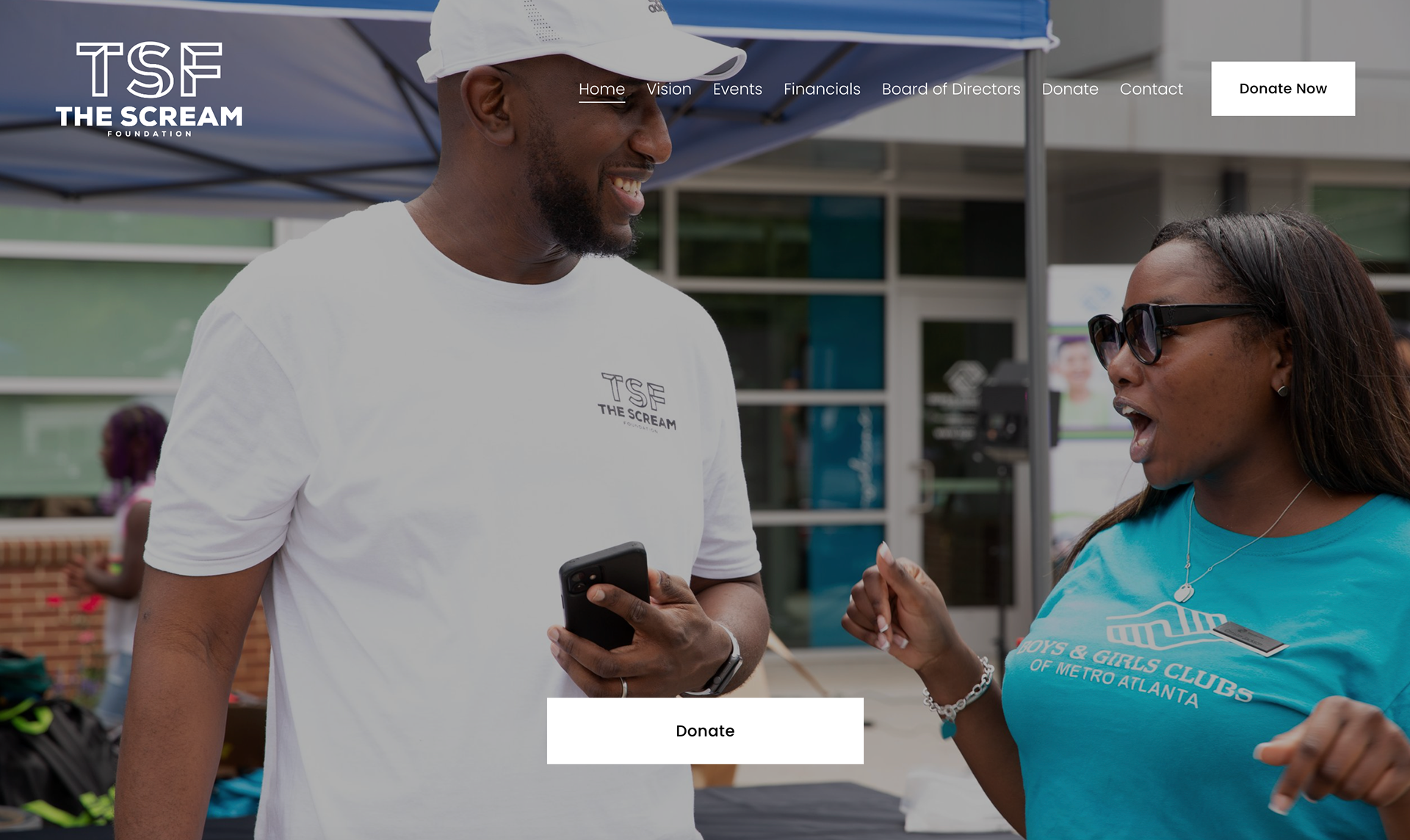
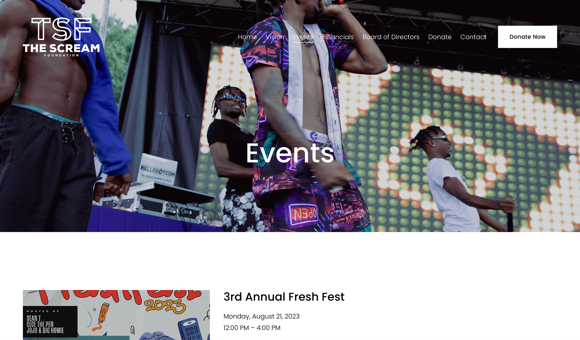
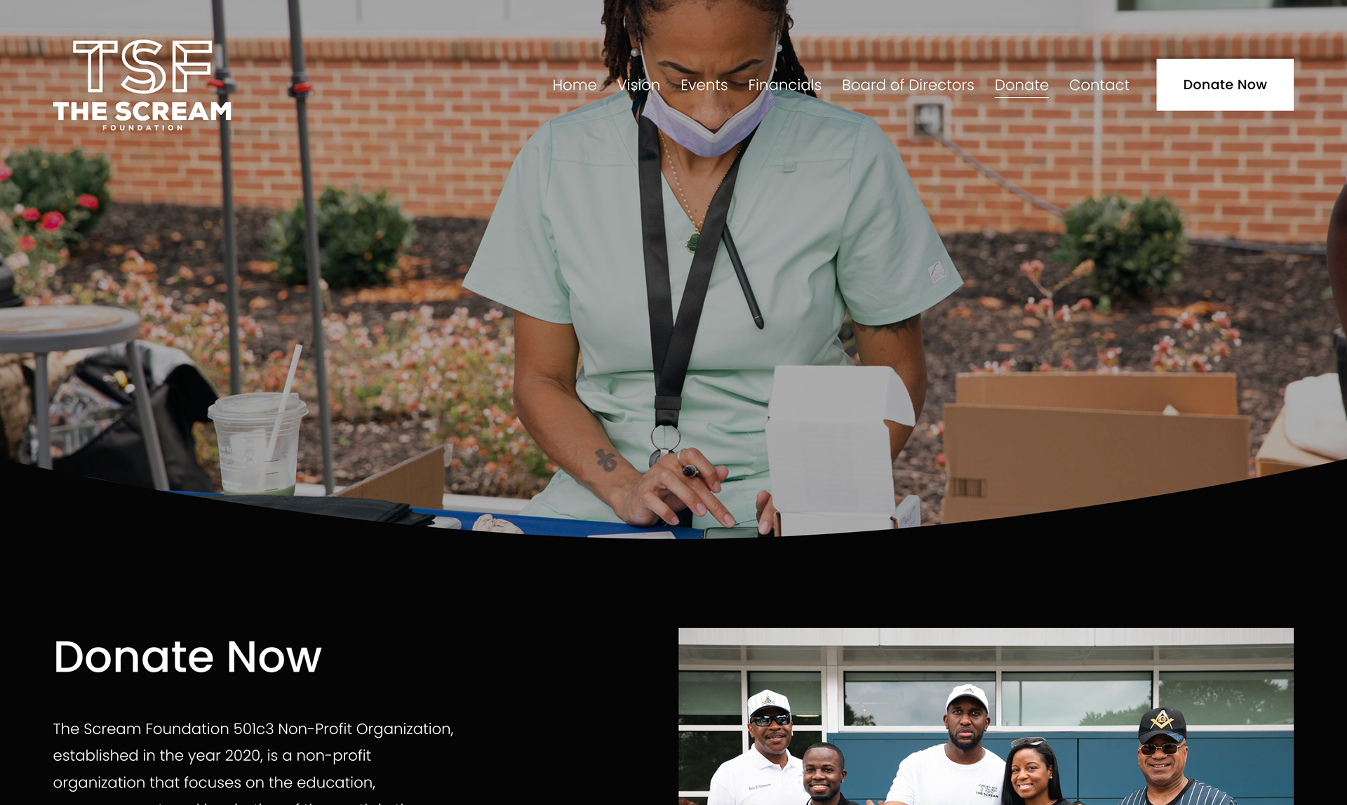
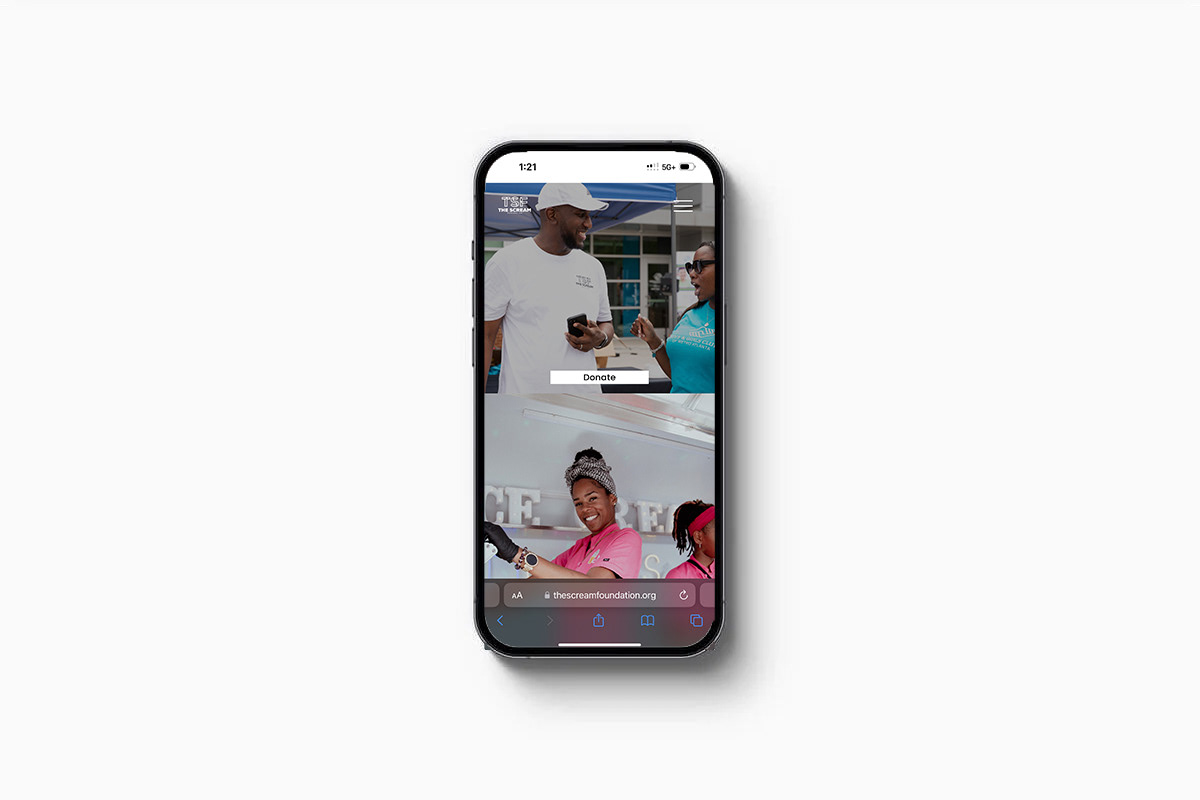
Case Study: The Scream Foundation
Industry: Nonprofit & Social Services
Services Provided: Website Development
Services Provided: Website Development
Client Overview
The Scream Foundation is a 501(c)(3) nonprofit organization established in 2020. Their mission is to empower and inspire youth in underserved communities by providing essential resources to help them focus on achieving their goals. The foundation addresses the concerns and disparities of these communities, ensuring that their voices are heard and their needs are met.
Project Scope
The goal was to design a website that clearly communicates The Scream Foundation's mission while providing a platform for education, empowerment, and outreach. The site needed to highlight the foundation’s various initiatives, engage potential donors and volunteers, and serve as a resource hub for the communities they serve.
Challenges
Mission-Driven Design: The site needed to reflect the foundation’s focus on youth empowerment, education, and community support while remaining approachable and informative.
Engagement: Encouraging visitors to get involved by donating, volunteering, or participating in events.
Resource Accessibility: Ensuring that the website provided easily accessible information about the foundation’s programs and ways to get involved.
Solution
Visual Design: Developed a vibrant, welcoming design that captures the energy of the foundation’s mission. The design uses bold typography, engaging imagery, and bright colors to appeal to a younger audience while also conveying the seriousness of their cause.
Structured Navigation: Organized the website into key sections, including the foundation's mission, programs, events, and ways to support, ensuring visitors can quickly find relevant information.
Call to Action: Strategically placed calls to action throughout the site, encouraging donations, volunteer sign-ups, and participation in events to maximize user engagement.
Mobile Optimization: Ensured the site was fully responsive, providing an excellent user experience across all devices, from desktops to mobile phones.
Results
Increased Participation: The engaging design and clear calls to action led to higher engagement, with more visitors signing up to volunteer and attend events.
Amplified Mission Awareness: The site effectively communicated the foundation’s mission, resulting in greater awareness and support from individuals and organizations.
Streamlined Resource Access: The structured layout made it easier for underserved youth and community leaders to access the resources they need.
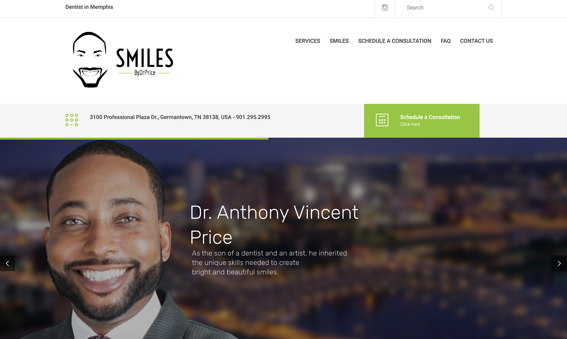
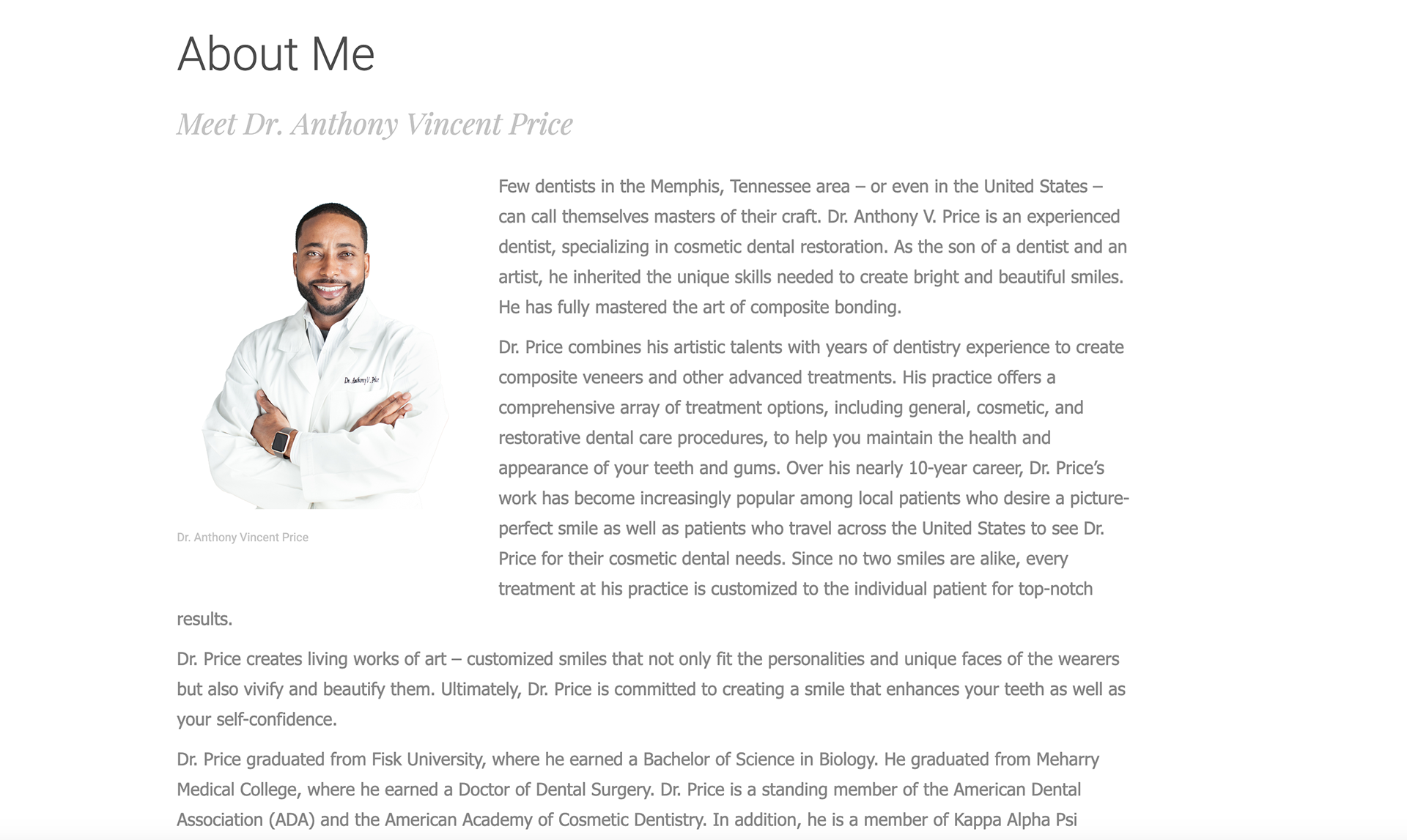
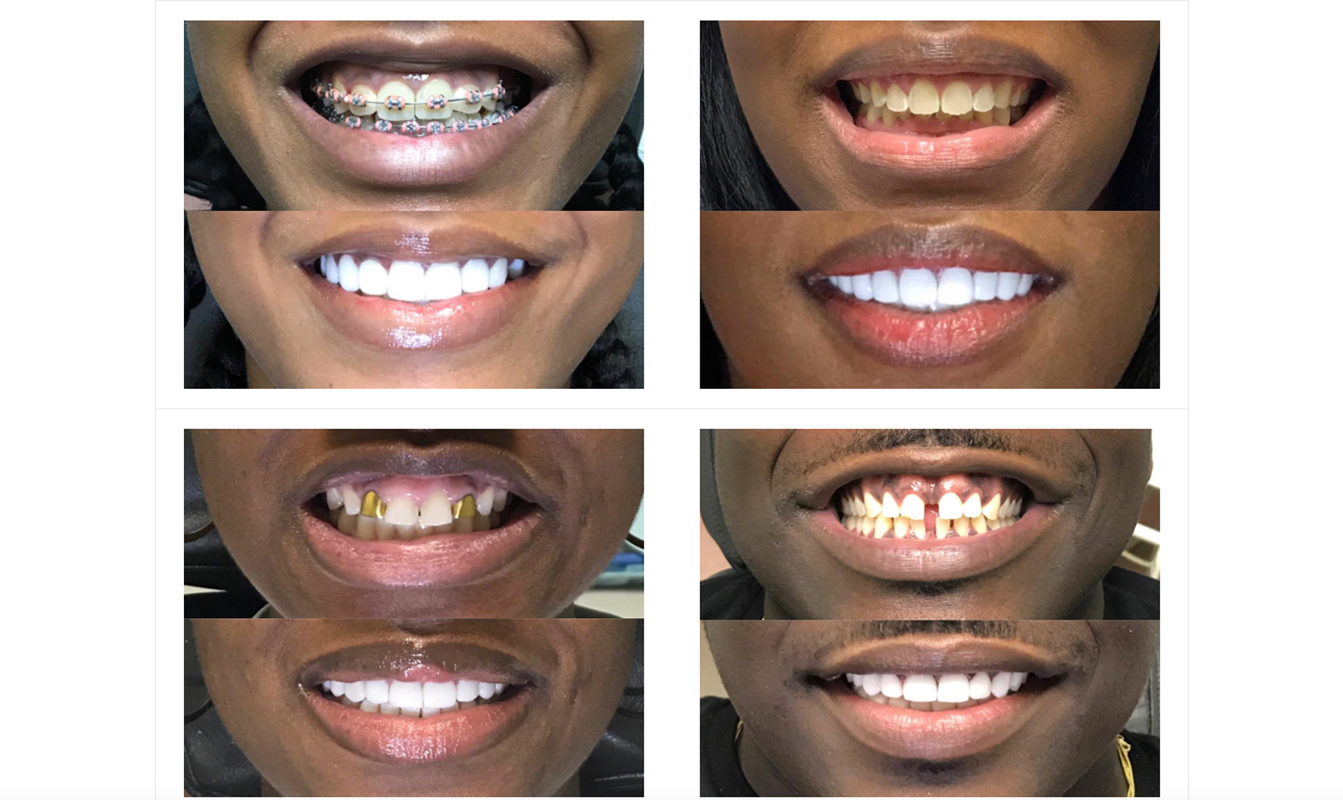
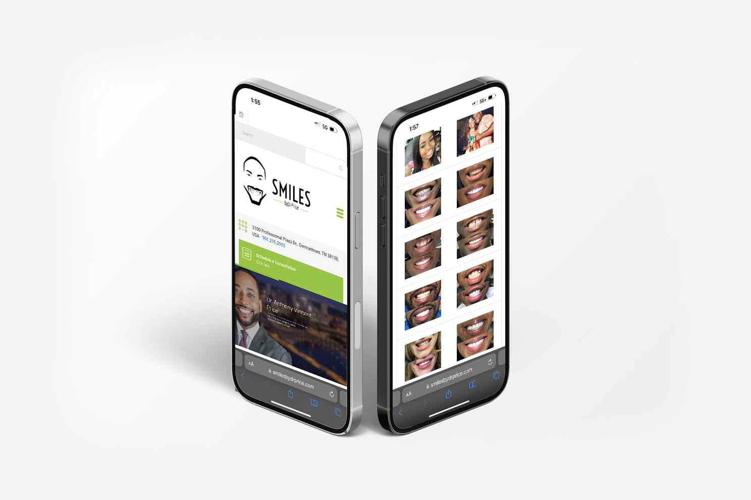
Case Study: Smiles by Dr. Price
Industry: Dental Care
Services Provided: Website Development
Services Provided: Website Development
Client Overview
Smiles by Dr. Price is a premier dental practice dedicated to providing exceptional orthodontic and cosmetic dental care. The client required a website that not only reflected their professional brand but also provided a user-friendly experience for patients seeking information about their services and booking appointments.
Project Scope
The goal was to create a clean, modern, and responsive website that highlighted Dr. Price’s expertise while making it easy for potential patients to navigate through services, book consultations, and learn about the practice. The project included full website design, mobile optimization, content layout, and seamless integration of booking functionalities.
Challenges
Brand Consistency: Ensuring the website design aligned with Dr. Price’s high standards of care and professionalism.
User Experience: Designing an intuitive site structure for visitors of all ages, from parents to teens.
Mobile Optimization: The site needed to work flawlessly on all devices to cater to a mobile-first audience.
Solution
Visual Design: Developed a sleek, minimalist design that reflects the dental practice's modern approach. The use of calming colors and clean lines aligns with the comfortable and welcoming experience they offer in person.
Navigation and Layout: The website is structured to make it easy for visitors to find relevant information, from specific treatments (such as Invisalign and braces) to patient testimonials. The layout ensures users can easily navigate the site, enhancing the user experience.
Appointment Booking Integration: Implemented a streamlined, user-friendly booking system that allows patients to request appointments directly through the website, saving time and enhancing accessibility.
Mobile Responsiveness: Ensured the site is fully responsive, adapting smoothly across various devices, from desktops to mobile phones, without compromising the design or usability.
Results
Increased Engagement: The intuitive design and clear calls-to-action led to an increase in appointment requests.
Positive Feedback: Both the client and their patients praised the clean design and ease of use, which has positively impacted the patient experience.
Enhanced Visibility: Optimized for SEO, the website helped improve the practice’s online visibility, making it easier for potential patients to discover Smiles by Dr. Price.
Case Study: KBB Salon
Industry: Beauty
Services Provided: Logo Design & Website Development
Services Provided: Logo Design & Website Development
Client Overview
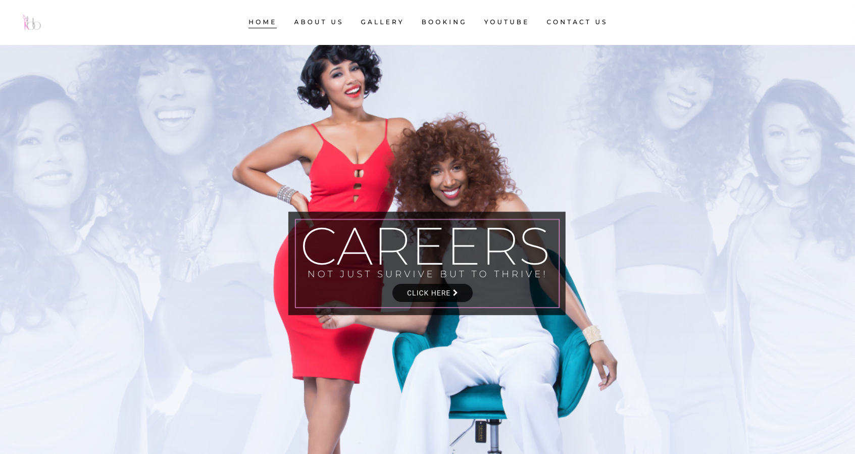
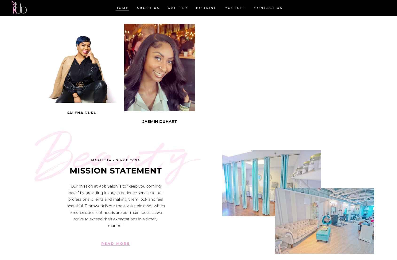
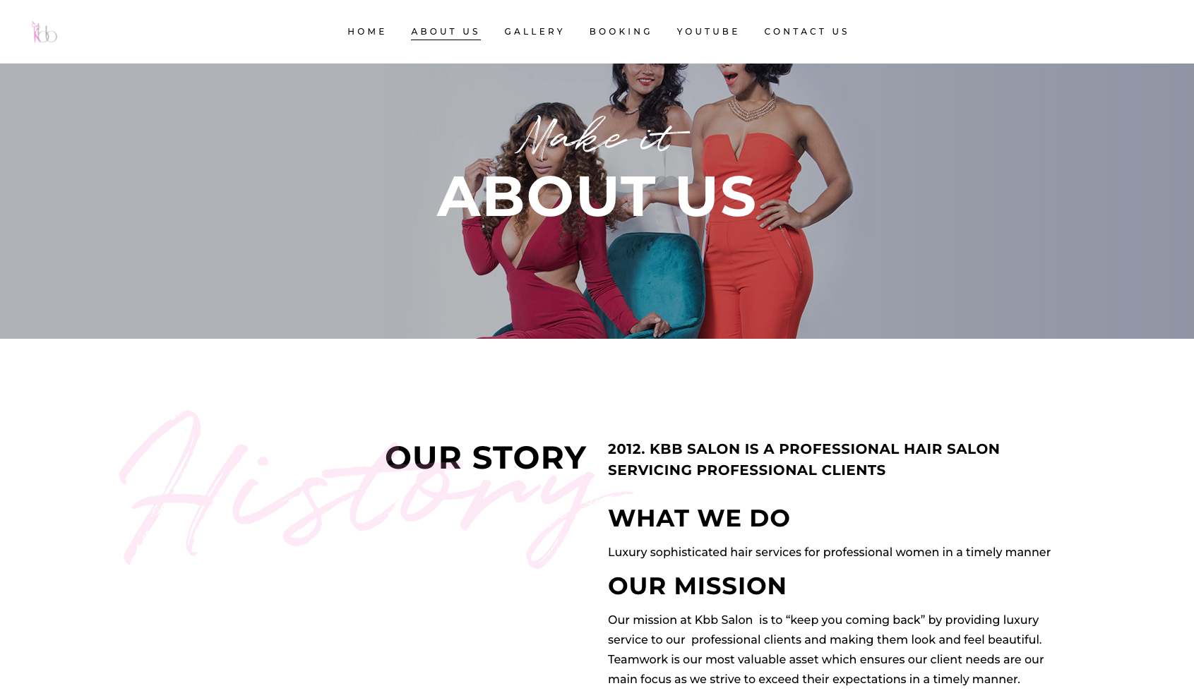
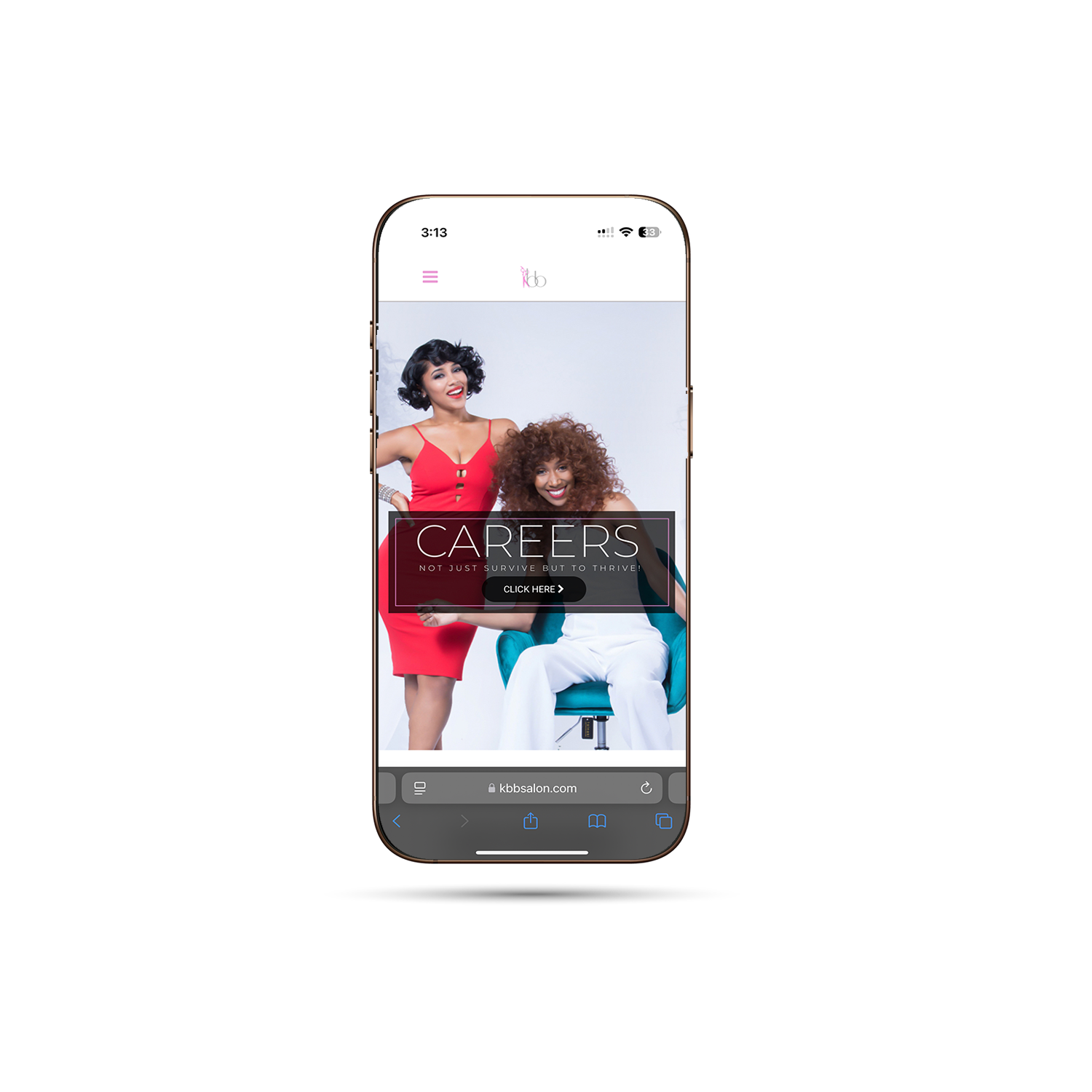
KBB Salon is a luxury beauty salon that offers high-end hairstyling, cutting-edge beauty treatments, and personalized customer care. The salon needed a website that would reflect its sophisticated brand identity, showcase its services, and provide an easy way for clients to book appointments online.
Project Scope
The objective was to create a sleek, modern logo and website that aligned with KBB Salon’s luxury image. The site needed to present the salon’s services clearly, highlight the expertise of its stylists, and include an integrated booking system to streamline customer appointments.
Challenges
Luxury Branding: Capturing the salon's upscale, high-end image through design while maintaining functionality.
Service Presentation: Structuring the service offerings in a way that was both visually appealing and easy for clients to navigate.
Appointment Booking: Ensuring that the booking system was user-friendly, responsive, and accessible on both desktop and mobile devices.
Solution
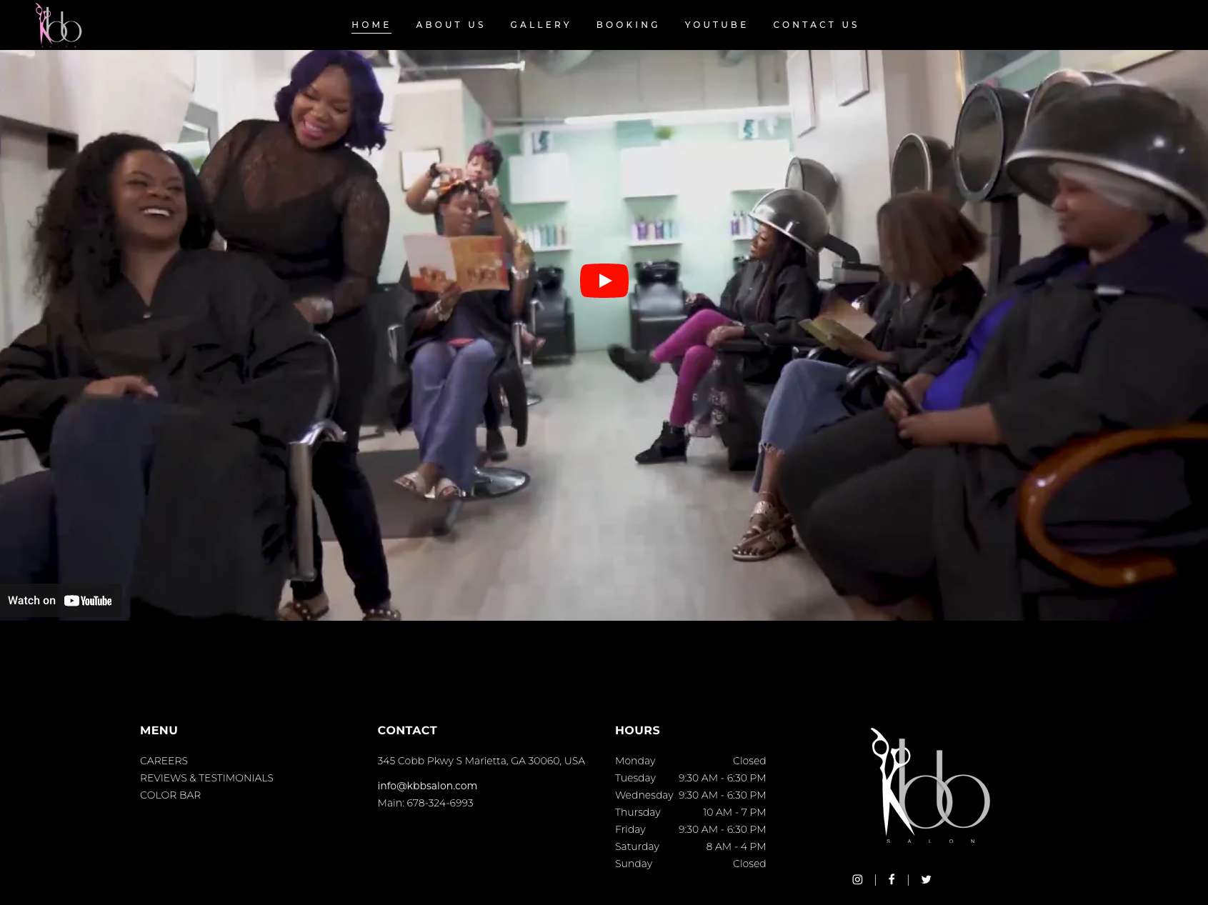
Visual Design: Designed a sleek and elegant website with clean lines, high-quality imagery, and a refined color palette to reflect the luxurious atmosphere of the salon. The use of large, professional photos of the salon and its services elevated the overall aesthetic.
Service Pages: Created dedicated service pages that detailed the salon’s offerings, from haircuts and coloring to spa treatments. These pages were optimized for clarity and ease of navigation, helping potential clients find the services they needed quickly.
Booking Integration: Integrated a seamless online booking system, allowing clients to easily schedule appointments with their preferred stylist or beautician. The system was optimized for both mobile and desktop to ensure accessibility across devices.
Mobile Optimization: Ensured the website was fully responsive, offering the same luxurious and professional experience on mobile devices as it did on desktops.
Results
Increased Client Engagement: The clean design and smooth booking process led to an increase in online appointment bookings.
Enhanced Brand Image: The high-end design helped solidify KBB Salon’s image as a luxury destination for beauty services, attracting new clients.
Positive Client Feedback: Both the salon and its clients appreciated the polished look and user-friendly nature of the site, which contributed to a stronger online presence.
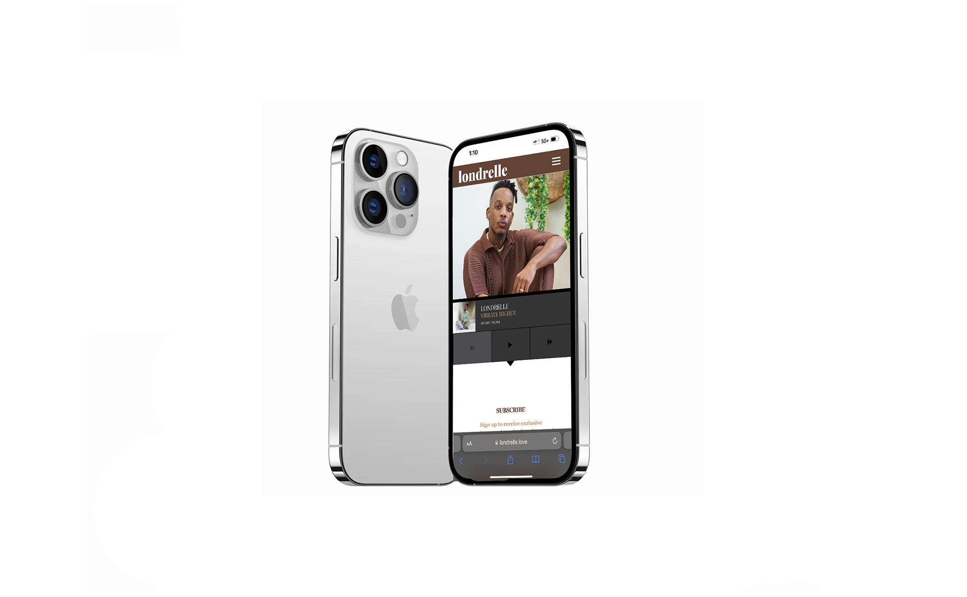
Case Study: Londrelle
Industry: Wellness & Personal Development
Services Provided: Website Development
Services Provided: Website Development
Client Overview
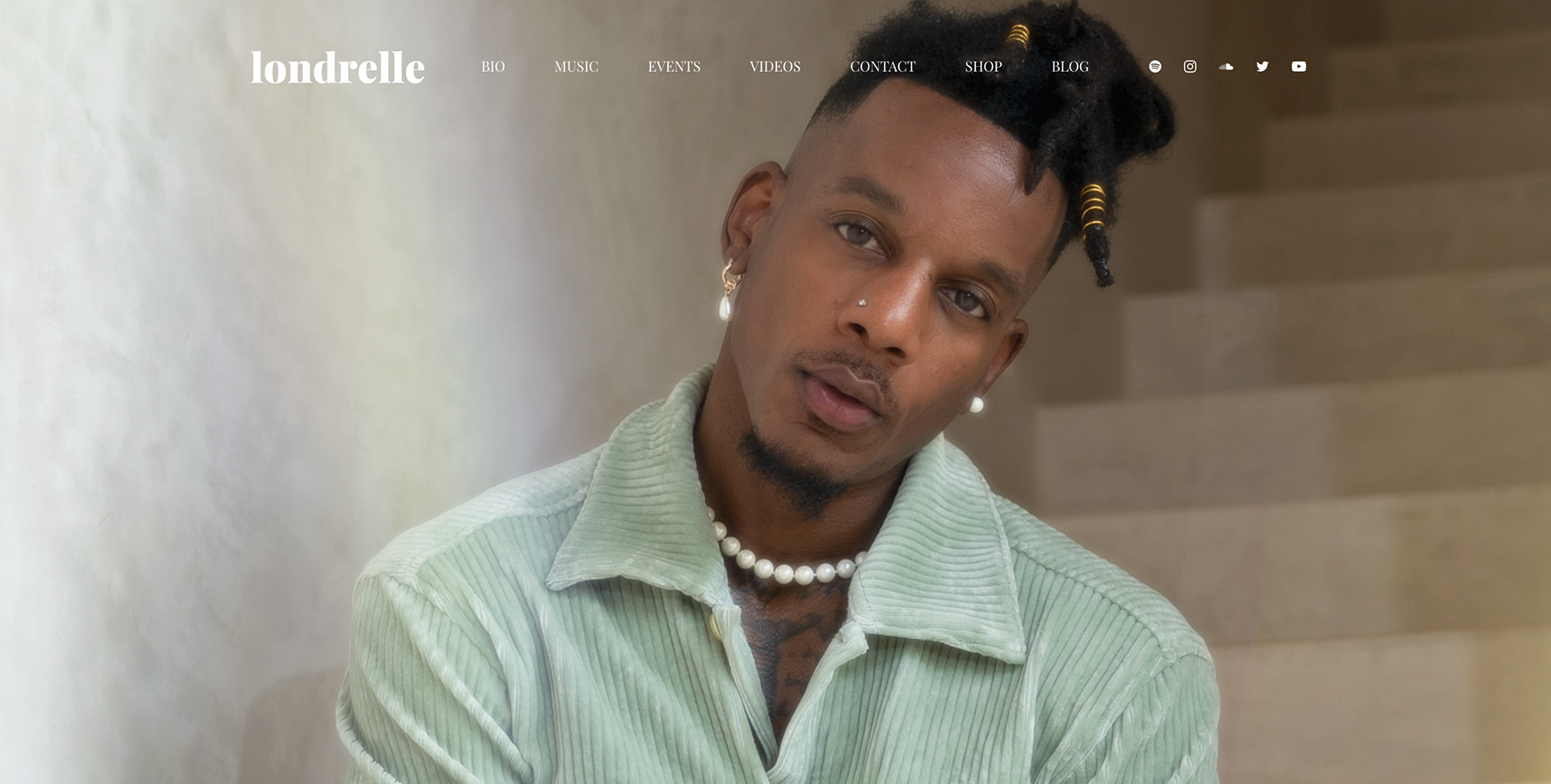
Londrelle is an artist, author, and spiritual guide whose work focuses on mindfulness, self-love, and spiritual awakening. He required a website that would reflect the depth and soulfulness of his brand while serving as a central platform to promote his books, music, and guided meditations.
Project Scope
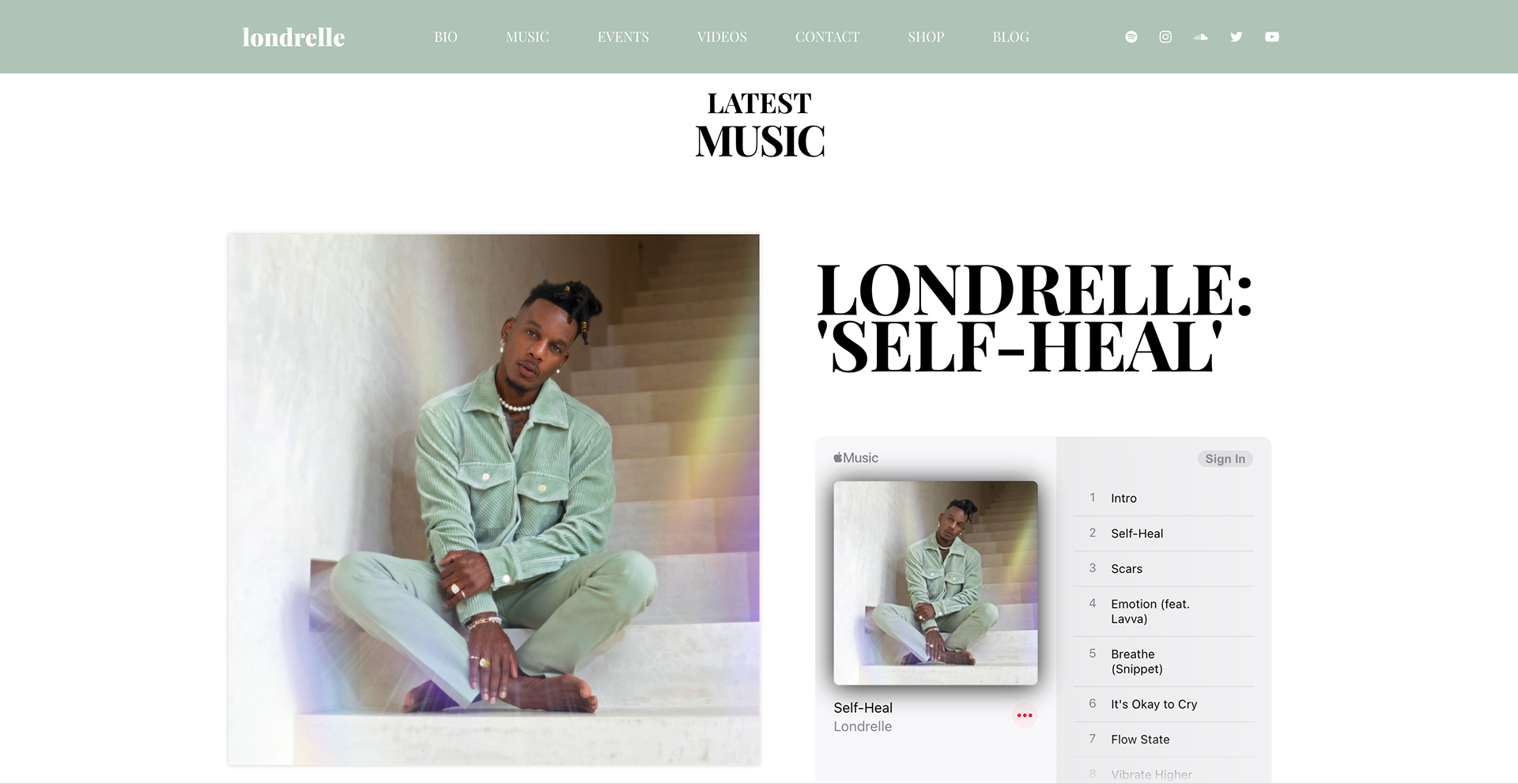
The goal was to design a visually captivating and functional website that showcases Londrelle’s creative offerings. The site needed to provide a seamless experience for users to explore his music, books, and spiritual teachings, while also incorporating e-commerce functionalities for purchasing digital and physical products.
Challenges
Artistic Expression: Ensuring the design reflected Londrelle’s unique artistic and spiritual vision while remaining user-friendly.
Content Organization: With multiple offerings (music, books, courses), it was important to structure the website so that users could easily explore all aspects of his work.
E-Commerce Integration: The site needed to offer smooth purchasing experiences for both digital and physical products.
Solution
Visual Design: Developed a serene and immersive aesthetic, using calming colors, fluid design elements, and meaningful imagery to reflect Londrelle’s spiritual essence and message of peace and self-love.
User Experience: Carefully organized content to guide visitors through Londrelle’s music, books, and meditations, ensuring clear navigation and a cohesive user journey.
E-Commerce Functionality: Integrated a secure and easy-to-use shopping cart system for selling books, music, and merchandise. The product pages were designed with simplicity and elegance, allowing the content to shine.
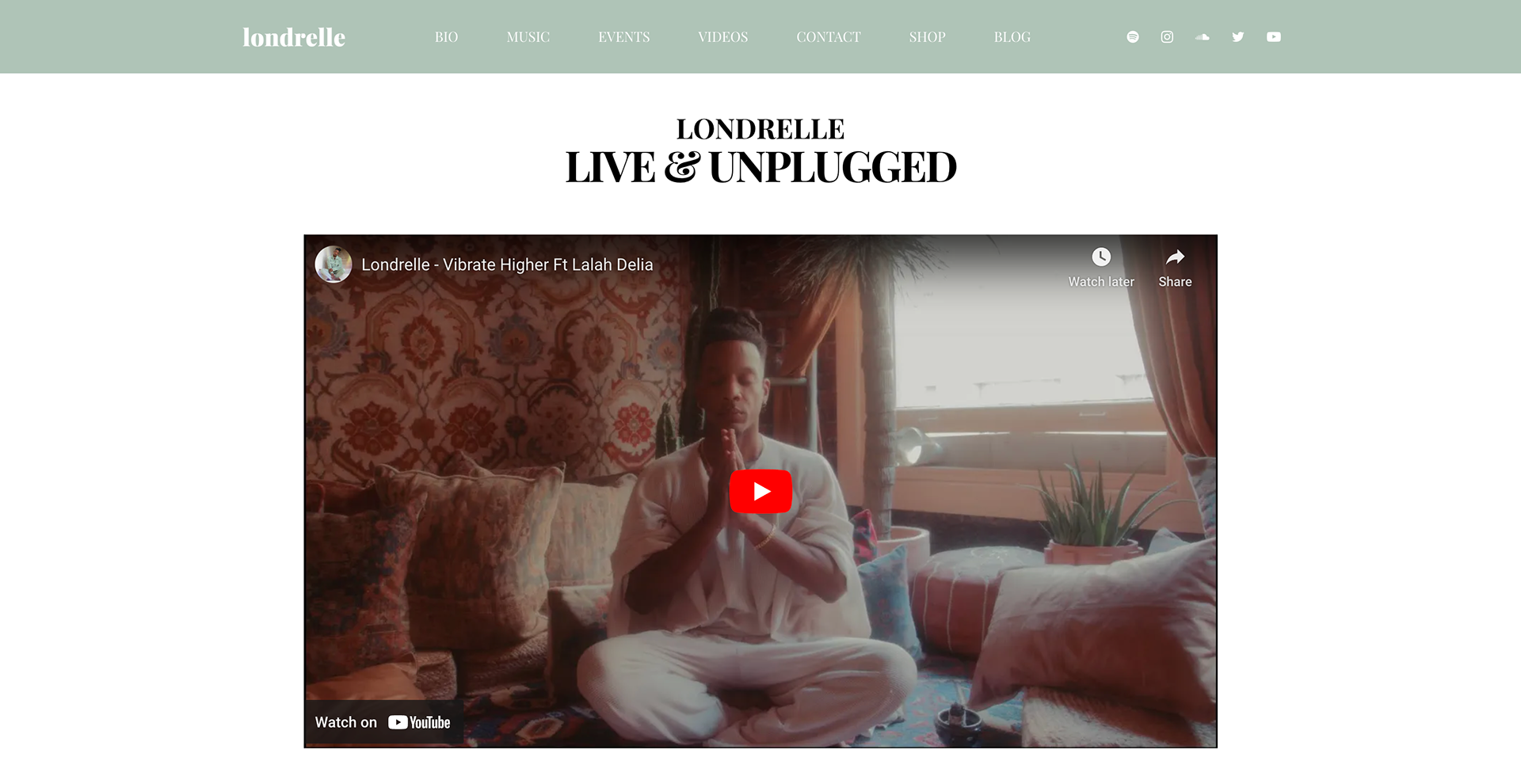
Multimedia Integration: Ensured seamless integration of Londrelle’s music and meditation audio, offering a rich multimedia experience that complements his brand’s message.
Responsive Design: Optimized the website for mobile devices, ensuring a smooth and engaging experience across all screen sizes.
Results
Enhanced Engagement: The visually appealing and easy-to-navigate website helped increase visitor interaction with Londrelle’s various offerings.
Streamlined Sales: The e-commerce setup facilitated increased product sales, allowing fans to easily purchase his books and music directly from the site.
Positive Feedback: Londrelle and his community praised the site for its beauty and ease of use, reinforcing the brand’s message of mindfulness and artistic depth.
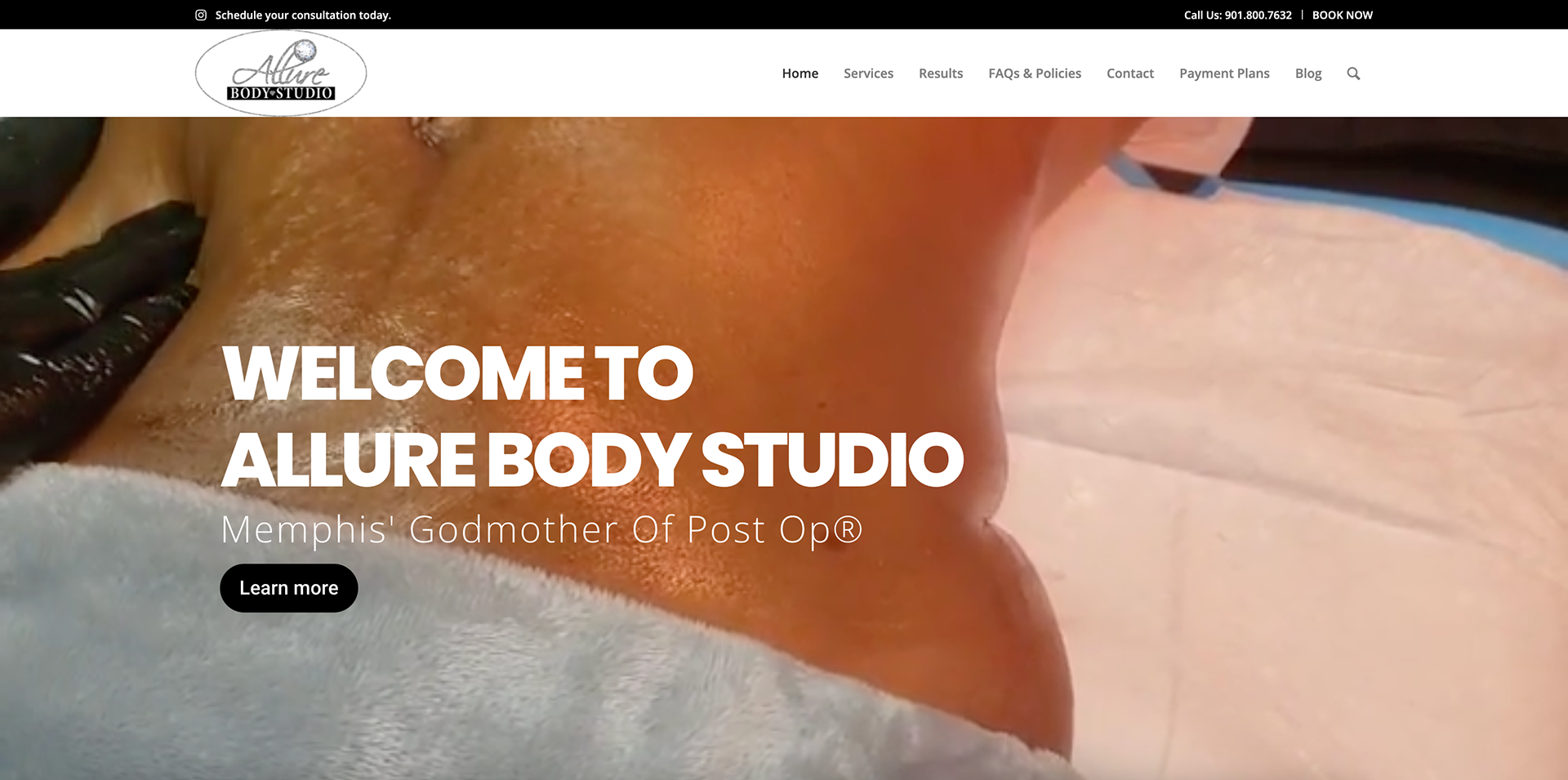
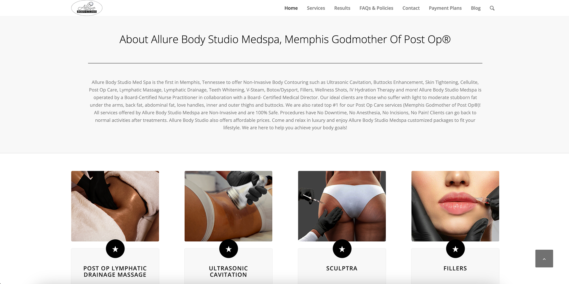
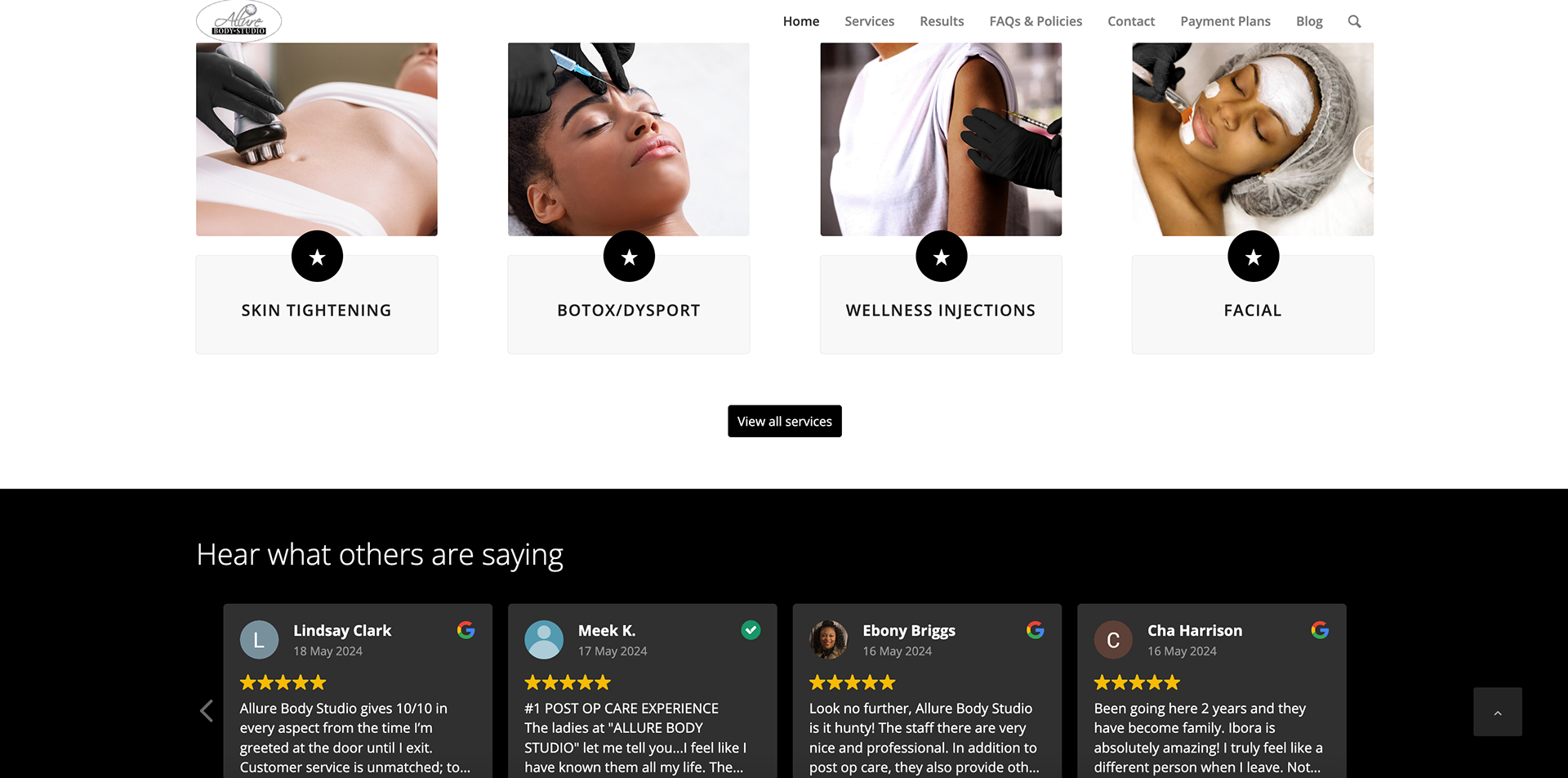
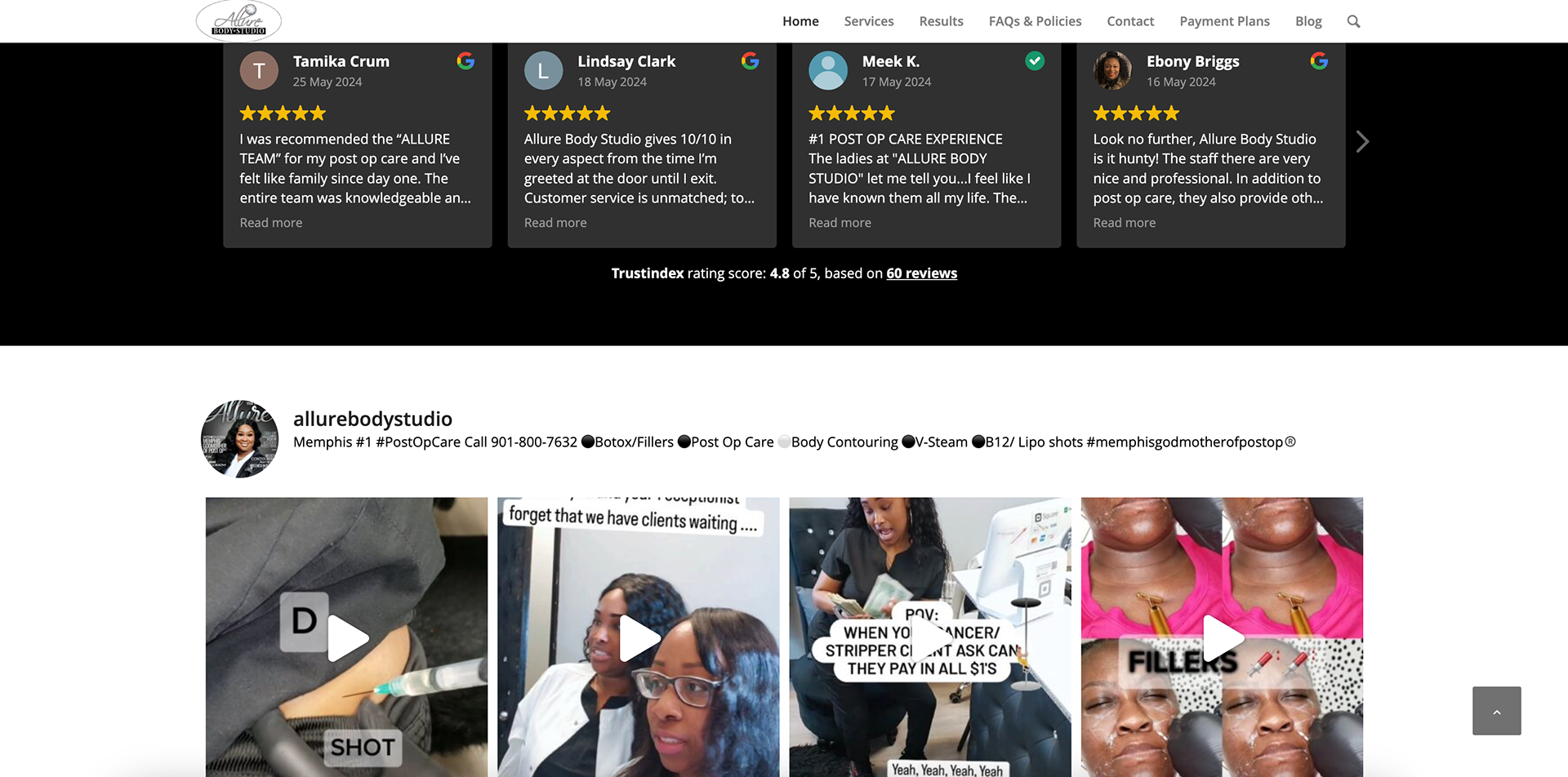
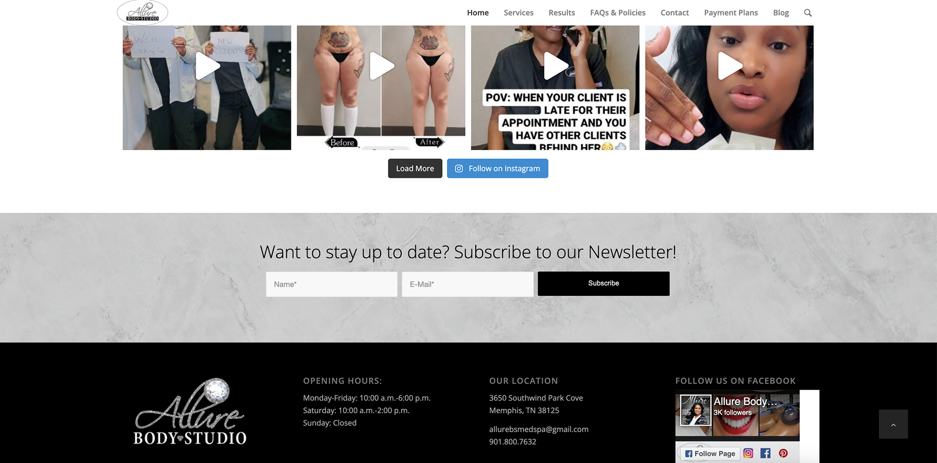
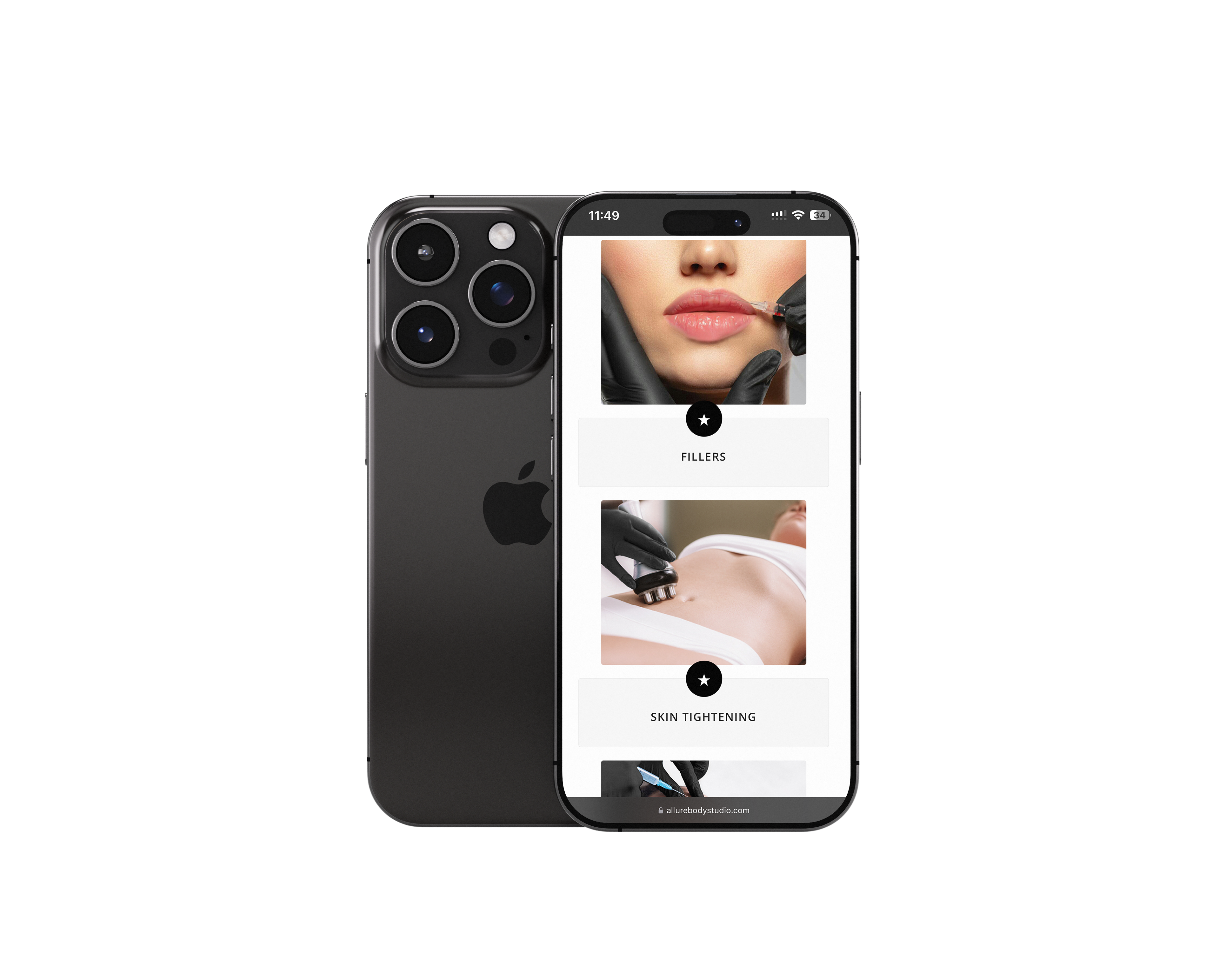
Case Study: Allure Body Studio
Industry: Health and Wellness (Med Spa)
Services Provided: Website Development & Digital Marketing
Services Provided: Website Development & Digital Marketing
Background
Allure Body Studio Med Spa, based in Memphis, Tennessee, is a premier med spa offering cutting-edge, non-invasive body contouring services and holistic wellness treatments. Operated by a Board-Certified Nurse Practitioner in collaboration with a Board-Certified Medical Director, Allure Body Studio specializes in treatments such as Ultrasonic Cavitation, Buttocks Enhancement, Lymphatic Massage, and more. The studio prides itself on providing safe, affordable, and effective solutions tailored to client lifestyles and goals.
Challenge
Allure Body Studio Med Spa needed a digital presence that matched the luxurious and innovative nature of their services. Their goals were to:
Highlight their unique offerings, such as being the first in Memphis for non-invasive body contouring.
Communicate their expertise and credibility as a medically supervised facility.
Showcase their #1-rated Post Op Care services.
Provide a seamless user experience for clients to explore treatments, learn about the benefits, and book appointments.
Solution
Through careful planning and collaboration, I designed a website that:
Enhanced Brand Identity: Developed a visually appealing design that reflects Allure’s luxurious ambiance and professional services.
User-Centric Navigation: Organized services into easy-to-access categories, ensuring clients can quickly find the information they need.
Educational Focus: Highlighted the safety, benefits, and expertise behind each treatment with engaging visuals and concise copy.
Call-to-Action Optimization: Incorporated clear booking buttons and contact forms, making it easy for potential clients to schedule appointments or inquire about services.
Mobile Responsiveness: Ensured a smooth user experience across all devices, recognizing the importance of mobile accessibility in the med spa industry.
Key Features
Service Highlight Sections: Dedicated pages for each treatment, detailing their benefits and targeting the ideal clientele.
Client Testimonials: Showcased feedback to build trust and demonstrate success.
Interactive Booking Tools: Integrated tools to facilitate appointment scheduling and inquiries directly from the website.
Luxury Aesthetic: Combined elegant colors, sleek typography, and high-quality visuals to capture the essence of Allure’s brand.
Results
Increased online visibility, attracting a broader audience.
Improved user engagement and website traffic.
Simplified booking process for clients, boosting conversion rates.
Elevated Allure’s credibility as a leader in non-invasive treatments in Memphis.
