Our brand identity services are designed to bring your unique vision to life and establish a cohesive, memorable presence in the marketplace. From logos to color schemes, typography, and visual elements, we create a distinctive identity that resonates with your audience and reflects the essence of your brand. Our goal is to build a foundation that not only sets you apart but also communicates your values and message consistently across all platforms. With a strategic approach, we help you craft a brand identity that leaves a lasting impression and builds trust, fostering strong connections with your customers.
























Our logo design service focuses on crafting unique, memorable identities that reflect your brand’s personality and values. From minimalist icons to intricate designs, we offer professional logos tailored to suit your specific business needs.
Pricing
Logo design services start at $300. Prices vary depending on the complexity of the design and any custom requests you may have.
Logo design services start at $300. Prices vary depending on the complexity of the design and any custom requests you may have.
Process & Timeline
Initial Consultation: We discuss your vision, business goals, and design preferences.
Design Creation: You will receive 3 distinct logo proofs to choose from, each showcasing a different interpretation of your brand.
Turnaround Time: 5 to 7 business days for the initial proofs. We prioritize efficiency while ensuring attention to detail.
Color Scheme Options
If you have an established color scheme, we’ll incorporate it into the design.
If no color scheme is provided, we’ll start with a black and white concept. Once a logo is chosen, color can be added for a refined final look that complements your brand.
Deliverables
Upon approval, you will receive the finalized logo in 5 versatile formats for easy use across platforms:
Upon approval, you will receive the finalized logo in 5 versatile formats for easy use across platforms:
PNG: High-quality image with a transparent background for online use
PDF: Ideal for professional printing and easy sharing
AI: Adobe Illustrator file for future editing and scalability
EPS: Vector file commonly used in professional printing
SVG: Scalable vector graphic for web and mobile applications
Case Studies
Case Study: Dr. Tiffany M. Rice
Location: New York | Service: Brand Identity
Project Scope
Design a unique and professional logo that represents Dr. Tiffany M. Rice, a licensed Nurse Practitioner specializing in non-surgical aesthetic medicine. The logo needed to encapsulate her focus on natural and sophisticated beauty while incorporating elements that highlight her expertise in advanced aesthetic treatments.
Objectives
Create a logo that subtly reflects Dr. Rice's initials, "T" and "R," while symbolizing her practice in aesthetic medicine.
Ensure the design conveys professionalism, elegance, and the medical nature of her services.
Develop a logo versatile enough to work across various branding materials, from digital platforms to print media.
Design Concept
The logo combines Dr. Rice's initials, "T" and "R," using a syringe to form the "T," which overlaps with the "R." The syringe represents her work in aesthetic medicine, symbolizing treatments such as dermal fillers and neurotoxins. The clean and minimalist style emphasizes a sophisticated approach, aligning with her dedication to a natural aesthetic and meticulous care.
Challenges
Balancing Medical and Aesthetic Elements: The challenge was to create a logo that would highlight her medical expertise without appearing overly clinical, as her focus is also on beauty and aesthetics.
Maintaining Simplicity and Memorability: Designing a logo that would be immediately recognizable and readable while incorporating complex ideas (initials and syringe symbolism) required a thoughtful approach to typography and layout.
Solutions
Elegant, Minimalist Design: By integrating the syringe within the "T" and blending it seamlessly with the "R," the design maintains a professional and refined look, representing both her initials and her area of expertise.
Symbolic Representation: The syringe as the "T" is a subtle nod to her focus on non-surgical aesthetic procedures, reinforcing her brand identity in a simple yet effective way.
Versatility in Application: The monochromatic design ensures that the logo can easily adapt across various media, from business cards and brochures to digital use on websites and social media.
Results
Increased Brand Recognition: The logo’s distinctive style has made Dr. Tiffany Rice’s brand more recognizable, reflecting her unique approach in aesthetic medicine.
Professional and Trustworthy Image: The logo projects Dr. Rice’s professionalism and dedication to a natural, safe approach in aesthetic treatments, helping to instill trust and confidence among her clients.
Positive Client Feedback: The logo has received positive feedback from clients, who appreciate the clean, modern look that aligns well with the advanced treatments she offers.
Conclusion
The custom-designed logo successfully embodies Dr. Tiffany Rice’s professionalism and expertise in aesthetic medicine. By creatively merging her initials with a syringe, we achieved a visually compelling brand identity that communicates her focus on beauty and safety in a sophisticated and memorable way. This branding serves as a foundation for further marketing efforts and solidifies Dr. Rice’s presence as a trusted provider in the aesthetic medicine industry.
The custom-designed logo successfully embodies Dr. Tiffany Rice’s professionalism and expertise in aesthetic medicine. By creatively merging her initials with a syringe, we achieved a visually compelling brand identity that communicates her focus on beauty and safety in a sophisticated and memorable way. This branding serves as a foundation for further marketing efforts and solidifies Dr. Rice’s presence as a trusted provider in the aesthetic medicine industry.
Featured on the largest billboard in Times Square
Case Study: Imprint Repairs
Location: Atlanta, GA | Service: Brand Identity
Project Scope
Imprint Repairs, a company specializing in the repair of mobile device screens, tablets, and smartwatch screens, wanted a logo that would capture the essence of their business while also conveying a friendly, trustworthy brand image. The goal was to create a memorable brand identity that would set them apart from other repair companies in the competitive electronics repair industry.
Challenges
Brand Recognition: Imprint Repairs needed a distinctive logo that would make a strong first impression and communicate the essence of their repair services.
Audience Appeal: The logo needed to appeal to a broad audience, including tech-savvy individuals and general consumers who seek quick, reliable device repair services.
Trustworthiness and Approachability: It was important to balance professionalism with a friendly and approachable design to make customers feel comfortable trusting Imprint Repairs with their devices.
Solutions
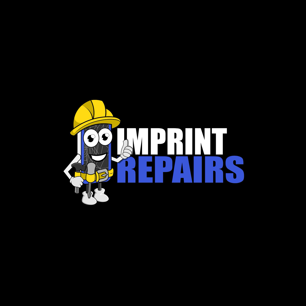
Character Design: We designed a character resembling a phone with a friendly face, dressed in a hard hat and tool belt to represent the repair aspect of the business. This character brings an approachable, lighthearted touch to the brand, making it memorable and appealing.
Bold Typography: The company name, "Imprint Repairs," is displayed in bold, contrasting white and blue letters, giving the logo a strong, professional look. The use of blue reinforces trustworthiness, while the structured, bold font ensures readability across different media.
Versatility: The logo was designed to be versatile, making it suitable for various applications, from store signage and repair van decals to digital use on their website and social media. The character’s design also lends itself well to possible future animations for digital marketing purposes.
Results
Increased Brand Recall: The unique character design helped Imprint Repairs stand out among competitors, creating a memorable logo that customers associate with quality and reliability.
Enhanced Visual Identity: With the new logo, Imprint Repairs now has a cohesive visual identity that effectively communicates the company’s purpose and personality, building customer confidence and attracting a wider audience.
Broadened Marketing Opportunities: The approachable logo design with a character enables Imprint Repairs to explore engaging marketing strategies, such as social media posts featuring the character in various repair scenarios, to further connect with their audience.
This logo project established Imprint Repairs as a recognizable and trustworthy brand in the electronics repair market, creating a foundation for brand growth and customer loyalty.
Live from the headquarters, Downtown Atlanta
Case Study: Pretty Girls Get Waxed
Location: Memphis, TN & Atlanta, GA | Service: Brand Identity & Digital Marketing Campaign
Project Scope
Pretty Girls Get Waxed sought a cohesive brand identity and digital presence that would resonate with its target audience, communicating both luxury and approachability. The goal was to create a memorable logo and implement a digital marketing strategy to establish brand recognition, increase foot traffic at both store locations, and boost online sales of waxing products for at-home use.
Challenges
Designing a logo that conveyed the luxury and professionalism of the brand, yet felt accessible to a broad audience.
Creating signage that would be visually striking and recognizable in physical locations, helping to attract new walk-ins.
Developing digital marketing campaigns that effectively communicated the brand’s luxury-oriented message and showcased their in-store services alongside their retail products.
Solutions
Logo & Brand Identity: Created an elegant, memorable logo that captured the luxurious feel of the brand. This logo was applied consistently across all marketing collateral, including in-store signage, product packaging, and digital platforms, helping to establish a cohesive and recognizable brand identity.
Signage for Physical Locations: Designed and coordinated the installation of striking signage for both store locations, ensuring the branding was consistent and visible from a distance, attracting new customers and enhancing brand visibility.
Digital Marketing Campaigns: Developed and managed digital campaigns to build brand awareness, promote the in-store waxing services, and drive online sales of at-home waxing products. Campaigns included targeted social media ads, email marketing, and seasonal promotions to engage and retain clients.
Results
Increased Brand Recognition: The cohesive branding and prominent signage solidified Pretty Girls Get Waxed’s presence as a luxury beauty provider, drawing in more customers to their physical locations.
Boosted Online Sales: The digital marketing campaigns significantly increased traffic to the website, driving more online purchases of their at-home waxing products and resulting in a notable increase in revenue.
Enhanced Client Engagement: Through social media and email campaigns, the brand built a loyal client base that actively engages with promotions, special offers, and new product launches.
This brand identity and digital marketing transformation positioned Pretty Girls Get Waxed as a leader in luxury waxing services and products, blending a sophisticated brand look with effective digital marketing to meet and exceed their business goals.
Case Study: Chings Hotwings
Location: Memphis, TN | Service: Rebrand
Project Scope
The redesign aimed to modernize the Chings brand, emphasizing its fiery flavor, strong Memphis roots, and athletic connections. The logo needed to visually capture the boldness of Chings’ famous wings and its appeal as a go-to spot for both casual dining and sports enthusiasts.Design Process
Research and Inspiration:
I explored Memphis culture, the local sports scene, and iconic elements that could represent the brand’s fiery and energetic personality. The concept focused on creating a logo that would stand out, attract sports fans, and evoke the heat and flavor Chings is known for.
Logo Elements
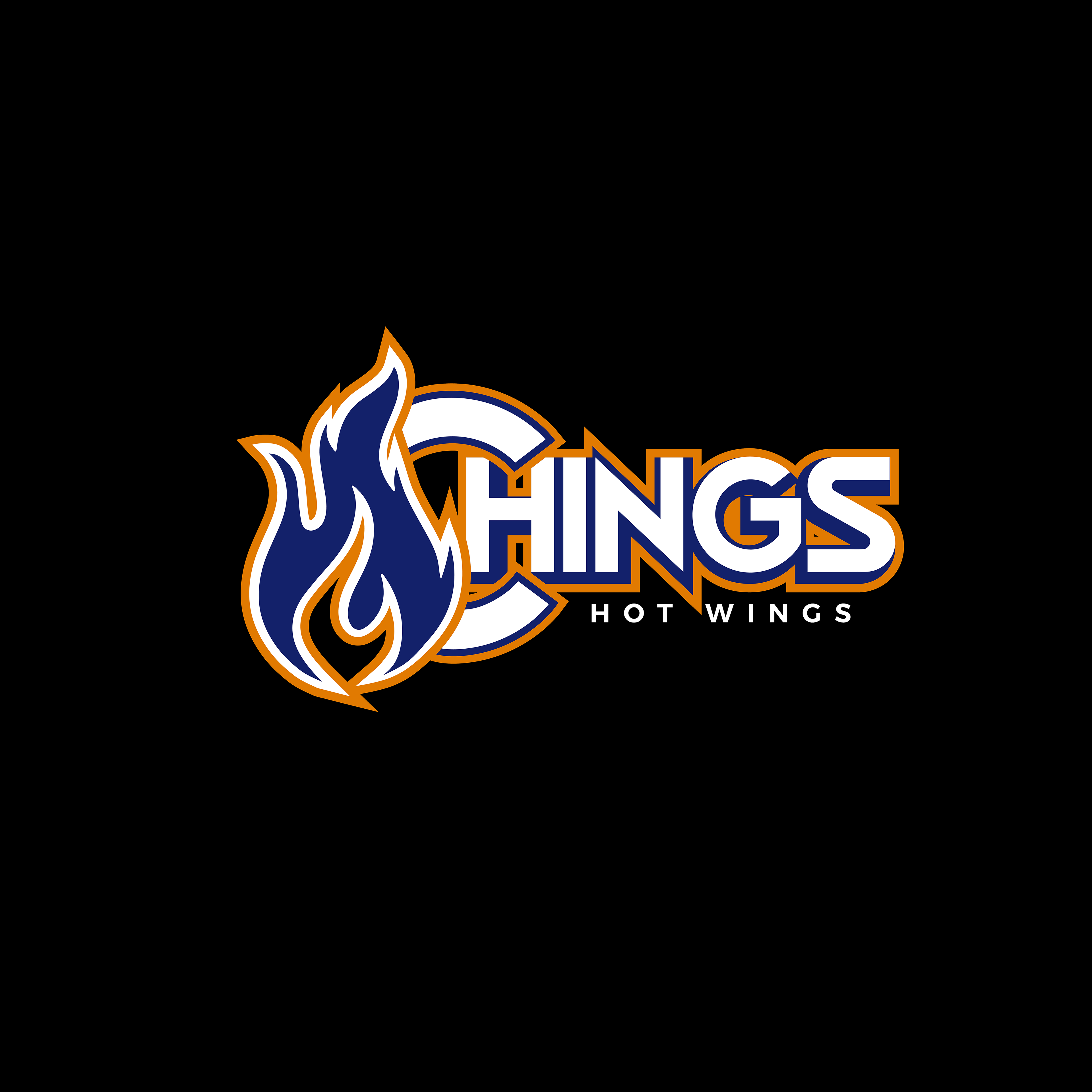
Flame Motif: The flame, integrated with the "C" in "Chings," visually represents the restaurant's spicy offerings and dynamic vibe. It serves as a powerful symbol of Chings' bold flavors and lively atmosphere.
Bold Typography: The strong, modern font reflects confidence and energy, appealing to Chings’ youthful and sports-oriented audience.
Color Scheme: The color choice combines vibrant orange with deep blue, adding visual impact and connecting subtly to sports colors often associated with Memphis teams. This mix reinforces the energetic atmosphere of Chings, tying it to the local sports community.
Implementation
The logo has been applied across various brand assets, from digital platforms like social media to in-store branding and merchandise. The cohesive design enhances Chings' brand presence and makes it instantly recognizable to fans and newcomers alike.
The logo has been applied across various brand assets, from digital platforms like social media to in-store branding and merchandise. The cohesive design enhances Chings' brand presence and makes it instantly recognizable to fans and newcomers alike.
Results
The redesign has received positive feedback, with customers, students, and athletes noting the logo’s vibrant and memorable appeal. It has been particularly effective on social media, where the bold design helps Chings stand out among other Memphis eateries and attracts sports fans who identify with the local culture.
The redesign has received positive feedback, with customers, students, and athletes noting the logo’s vibrant and memorable appeal. It has been particularly effective on social media, where the bold design helps Chings stand out among other Memphis eateries and attracts sports fans who identify with the local culture.
Case Study: Sweet Temptation Hair
Location: Memphis, TN | Service: Brand Identity
Project Scope
Sweet Temptation Hair is a luxury hair extensions company and beauty salon, known for providing premium hair products and services. The brand sought a cohesive identity that would communicate elegance, style, and allure to attract a high-end clientele.
Objectives
Create a Distinctive Logo: Develop a logo that reflects the brand’s sophistication and quality offerings.
Build Brand Recognition: Ensure that the logo and branding elements are versatile for use across various marketing materials and salon tools.
Elevate Brand Perception: Position Sweet Temptation Hair as a top-tier destination for hair extensions and beauty services.
Brand Identity Development
The brand identity was crafted to align with Sweet Temptation Hair’s mission of offering luxurious hair products and beauty experiences. This included the following elements:
Logo Design:
The logo features a flowing, elegant script for “Sweet Temptation” in bold red, symbolizing passion and allure, paired with a clean, modern font for “Hair & Lashes” in black, adding a sophisticated contrast to the brand’s overall look.
The unique script style evokes a sense of temptation and refinement, immediately associating the brand with beauty and luxury.
Versatile Application:
The logo was implemented on a variety of marketing collateral, including business cards, social media graphics, and salon decor, enhancing brand visibility. It was also featured on salon capes, adding a professional, branded touch to each client interaction.
Results
Increased Brand Recognition: The distinctive logo helped establish Sweet Temptation Hair as a recognizable brand within the beauty industry, setting it apart from competitors.
Enhanced Professionalism: Consistent use of the logo across digital and physical assets created a polished and cohesive brand experience.
Strengthened Customer Loyalty: The memorable and high-end brand identity resonated with customers, reinforcing Sweet Temptation Hair’s position as a trusted, luxury beauty brand.
Conclusion
The brand identity crafted for Sweet Temptation Hair successfully conveyed the luxurious essence of the business. With a refined logo and consistent branding elements, Sweet Temptation Hair has created a strong visual impact across all platforms, enhancing both brand visibility and customer loyalty.
Today, Sweet Temptation Hair enjoys a cohesive and elegant brand presence that resonates with its target audience, supporting its growth as a premium player in the hair and beauty market.
